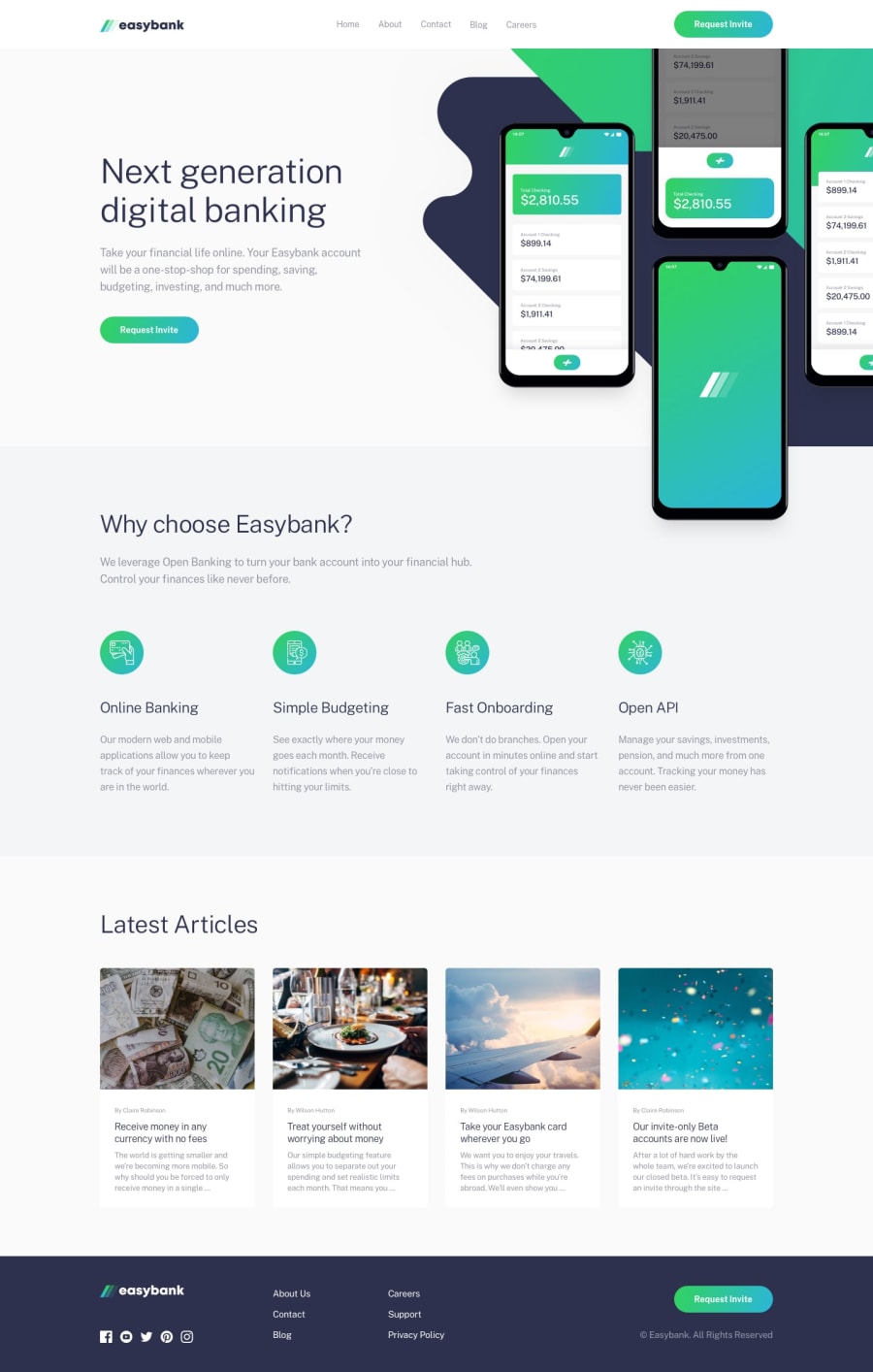
Design comparison
Solution retrospective
Damn, i hate image placing like in first section.
If someone have an example or best practice to place image and background-image easier, i would be very grateful.
Community feedback
- @RocTanweerPosted over 3 years ago
There are some accessibility issues, solve them if you can, if you can't then dm me on twitter
1 - @RocTanweerPosted over 3 years ago
Hello 👋 @ Nikolay
Nice 👍 work ☺️ on this one..!
I also struggled with that too...
What I did...
- I made
section.wrapperwith position relative and overflow hidden. - placed
div.wrapper__bg, div.hero, div.features,div.articlesinto it as direct child. - Made
div.wrapper__bg { position : absolute;and placed as per design. - Made that background-image into div.hero with hero text.
The thing is position relative to parent and absolute to children
I cannot explain everything here 😅, if you are curious, then you can look at my solution, it's reader friendly. 😊
I tried my best to explain...
Hope it helps and happy coding 😉
1@tydusggPosted over 3 years ago@RocTanweer Thanks for advice! I did the same and it looks good in full hd, but when i resize window it becomes very ugly.
So, i still looking for a way to solve that problem :3
0 - I made
- @nmorajdaPosted over 3 years ago
Good job! In the mobile view your menu is visible "by default". It should be visible after clicking.
0
Please log in to post a comment
Log in with GitHubJoin our Discord community
Join thousands of Frontend Mentor community members taking the challenges, sharing resources, helping each other, and chatting about all things front-end!
Join our Discord
