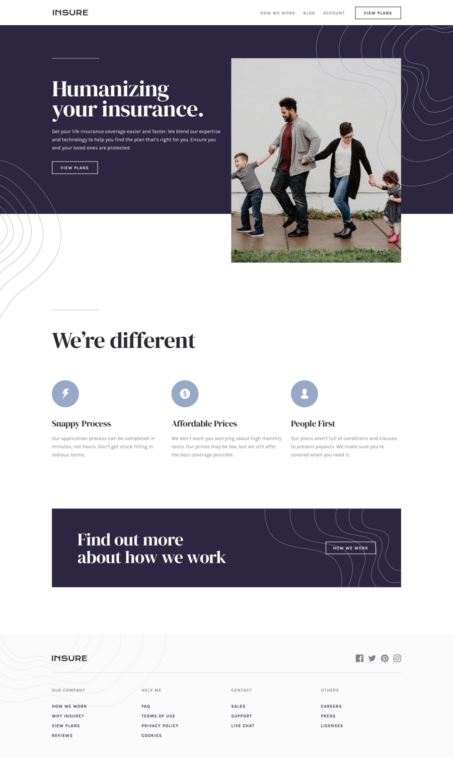
Design comparison
Solution retrospective
I have added a bit animations to the webpage and I have used JS for the mobile navigation toggle.
Any feedback would be appreciated!
Happy Coding!
Community feedback
- @tedikoPosted over 3 years ago
Hello, Suraj! 👋
Good job on this challenge! Your solution responds well and looks nice. Kuds for animations you add. Some tips from me:
- Since your
.logoand others images are decorative youralttext should be provided empty (alt="") so that they can be ignored by assistive technologies, such as screen readers. - Add
:focuspseudo class to interactive elements like anchors, buttons etc. Useoutlineproperty to make your website more accessible to keyboard users. Focusable elements like anchor, buttons or inputs they have applied default:focuspseudo class withoutlineproperty. These default styles are subtle and hardly visible tho. Furthermore every browser has a slightly different default style for the outline, so you probably want to change the default style. Read more about why we should change focus styles. - Your footer social icons are lacking anchor tags.
Good luck with that, have fun coding! 💪
1@Suraj1333Posted over 3 years ago@tediko Thank you for the feedback. What you shared with me will help me to improve my coding skills and the way I do it. Have learnt a lot!
Thank you!
Happy coding!!
0 - Since your
- @palgrammingPosted over 3 years ago
The animation interesting the only thing I see is that at mobile 375px wide you might want to work on your positioning of some of those elements they do not seem quite aligned where they should be
1
Please log in to post a comment
Log in with GitHubJoin our Discord community
Join thousands of Frontend Mentor community members taking the challenges, sharing resources, helping each other, and chatting about all things front-end!
Join our Discord
