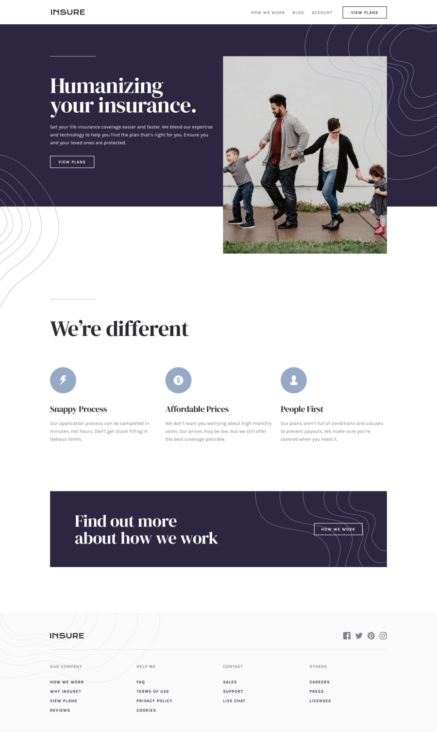
Design comparison
Solution retrospective
Hi there. I had issues with using the same set of nav links for both mobile and desktop screen widths. To work around this, I wrote two different sets of nav links; one for mobile and the other for desktop and hid them accordingly. I know this is not standard procedure and I'd appreciate all the help I can find in refactoring my code.
Looking forward to receiving suggestions on other matters as well. Cheers
Community feedback
- @MikeBish13Posted over 3 years ago
Hey, nice job overall.
In terms of the nav links, I would consider using a
ulfor the list and then anlifor each link, with anatag inside eachli- this is generally the standard way of creating a nav.In terms of responsiveness for mobile and desktop, have a think about you could potentially use
position:absoluteon the nav when you're in mobile view, and how this could be combined with some simple javascript toggling ofdisplay: block/noneon the click of the hamburger, as you've already demonstrated.One general comment is that your media query breaks into mobile view a little bit too soon - I'd maybe consider lowering this to around the 700px mark.
Hope this helps!
Marked as helpful0
Please log in to post a comment
Log in with GitHubJoin our Discord community
Join thousands of Frontend Mentor community members taking the challenges, sharing resources, helping each other, and chatting about all things front-end!
Join our Discord
