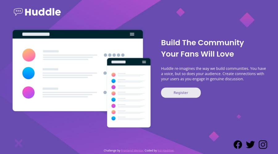


Design comparison

Solution retrospective
Okay, I'm going to come straight out of the gate and say I have NO IDEA what I'm doing for the middle area of the screen width. It looks good at 1440px. It looks good at 375px. Anything in between, I'm clueless. I tried for hours to get it to work before eventually giving up and turning to you guys. Can anyone help me with figuring out how to make it not look terrible in those middle sections? Thank you!!
If you're wondering what I'm talking about, go to Chrome's inspection tool, go to responsive mode, set it to 1440px, and just... slowly shrink it. It's terrible. I know it's terrible. You'll know it's terrible. I'm having a painful learning experience right now.
Community feedback
- @SoaphubPosted over 1 year ago
Hey Koi Hastilow, great work and keep trying for a better responsive website. The website looks good, I can add some suggestions which I am following. You can try it.
- I reviewed your index.html page and found all the icons in the <main/>, you could place that in the <footer> which makes it typical and easy to bifurcate the page. The footer can contain the address and contact info.
- In the CSS stylesheet it is better to avoid fixing the height to 100vh. Don't worry about the height, users love scrolling.
- In the media query I found u repeating classes .content .text .main to make the flex direction colomn. If you want a more responsive website. There are some default breakpoints below, choose which is required.
- Add all common styles like flex-direction, text alignment etc... below screen size 991.98px where the grid pattern changes. eg: @media (max-width: 991.98px){}. Then for more specific styling like the width of image text use the below breakpoints.
@media (max-width: 575.98px) { ... }
// Small devices (landscape phone)
@media (min-width: 576px) and (max-width: 767.98px) { ... }
// Medium devices (tablet, 768px and up)
@media (min-width: 768px)  and (max-width: 991.98px) { ... }
// Large devices (desktops, 992px and up)
@media  (min-width: 992px) and (max-width: 1199.98px) { ... }
// X-Large devices (large desktops, 1200px and up)
@media (min-width: 1200px) and (max-width: 1399.98px) { ... }
// XX-Large devices (large desktops, 1400px and up)
@media (min-width: 1400px)
Hope it was helpful...
Marked as helpful0 - @vanzasetiaPosted over 1 year ago
Hi, Koi Hastilow! 👋
I know it could be hard to decide how the web should look between those screen sizes. I was also having that kind of experience. 😅
The easiest thing that you can do is to adjust the breakpoint.
768pxfor mobile layout is too late. The point is to make the layout into a one-column layout when you see there is not enough space for a two-column layout.Then, to make it better, you can set a
max-widthto prevent the text from getting too large. Text with a long line can be hard for people to lead reading.In the future, I recommend writing the CSS using the mobile-first approach (using
min-widthmedia queries). The mobile layout is simple. So, you only need to add more complex styling for larger screen sizes.If you use the desktop-first approach, then you need to write more CSS to simplify the layout (usually into a one-column layout).
The mobile-first approach often results in smaller CSS. As a result, the website loads faster.
Learn more — Responsive design ground rules | Polypane
I hope this helps. Happy coding! 😄
Marked as helpful0 - @leonpaholePosted over 1 year ago
Hey Koi, first of all, in a real world project, making decisions for how to display something on a certain screen size is not up to us developers, but up to designers. So whenever I have a dilemma like yours in a real project, I always step up to the designer or whoever else is responsible for designs. They will know what to do to make it look nicer, and then it's up to us developers to implement that. We call this a "product" or a "design" decision.
It's really important that as developers we know what is in our realm of decisions and what we should reach out for. A good developer is not the one who can solve every problem, but the one who knows when and who to ask to get answers. This can save a lot of time on a real world project.
Since in this case you don't have a designer you could ask, you have to kind of play it by ear. My suggestion is that you either reduce the image size or break into columns earlier.
By the way, I suggest that you wrap the image in a div, because image as flex child can behave somewhat weirdly.
I played around a bit with your site and did the following (my additions are in inline styles, but don't use inline styles):
<div class="content" style="max-width: 1000px;">
<div style="max-width: 600px;display: flex;align-items: center; flex: 1;">
<img style="width: 100%; height: auto">
</div>
<div class="text" style="flex: 1" >{...}</div>
</div>
And it seems to be looking quite nice. What I did here is I made both sides equal width, but the image container is capped at 600px. Also since image is in a wrapper, it is easier to make it preserve it's aspect ratio. Then I also capped the width of the wrapping container at 1000px. This prevents the text from expanding into a single line on really large screens. Of course you can tweak all of these numbers.
Side note: I did not adjust for mobile using my styles. You will have to use media queries to make sure the site still looks good on mobile.
Marked as helpful0


Please log in to post a comment
Log in with GitHub
Join our Discord community
Join thousands of Frontend Mentor community members taking the challenges, sharing resources, helping each other, and chatting about all things front-end!
Join our Discord