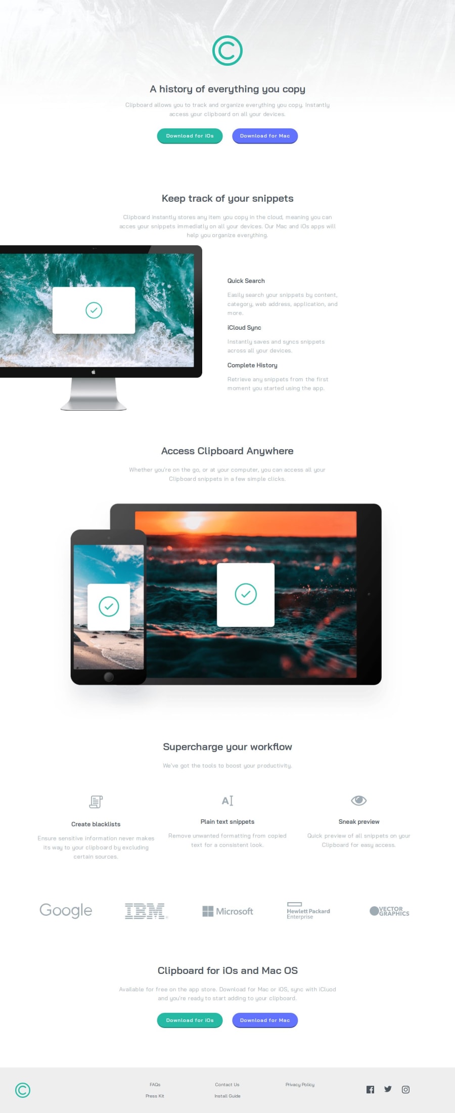
Design comparison
Solution retrospective
The challenging part was solving the computer image section so that it wouldn’t lose its proportion when the screen size changed. I resolved it by using position: absolute and auto margin within the container. The same approach worked for the side texts.
What specific areas of your project would you like help with?Maybe another way to solve the computer image section
Community feedback
- @huyphan2210Posted about 1 month ago
Hi, @Darionvr,
I checked out your solution and have a few thoughts:
- Let's just remove all the CSS in the Keep Track of Your Snippets section and arrange the html again - which I try to explain below.
- Your Keep Track of Your Snippets section (the computer section) could be improved. You don’t need to use flexbox on the
section
itself, assection
is a block-level element. Its child elements, likeh2
andp
, are also block-level. I recommend creating another block element for your computer image and the three feature texts, which will allow thesection
to have three distinct blocks. - For the computer image within the
section
, assuming you did the above - which is placing the image and the feature texts inside a block-level element, consider using Grid or Flexbox to split the element into two sides—one for the image and one for the feature texts. This way, you can align everything neatly. You can also set the image width to[number_of_your_choice]%
of its parent container (which is in this case, a block-level element) to ensure it scales correctly.
Overall, I think there’s room for improvement in your HTML structure, especially regarding how to arrange tags for simpler CSS styling. I believe your question has to do a lot with it, and I encourage you to explore this topic further and experiment with different approaches.
Hope this helps!
Marked as helpful1@DarionvrPosted about 1 month ago@huyphan2210 Thank you very much for this feedback! It was just what I needed because my solution to the challenge looks ‘good,’ but the code didn’t seem as organized in the way I had achieved it. I will put it into practice to submit a new response :)
0
Please log in to post a comment
Log in with GitHubJoin our Discord community
Join thousands of Frontend Mentor community members taking the challenges, sharing resources, helping each other, and chatting about all things front-end!
Join our Discord