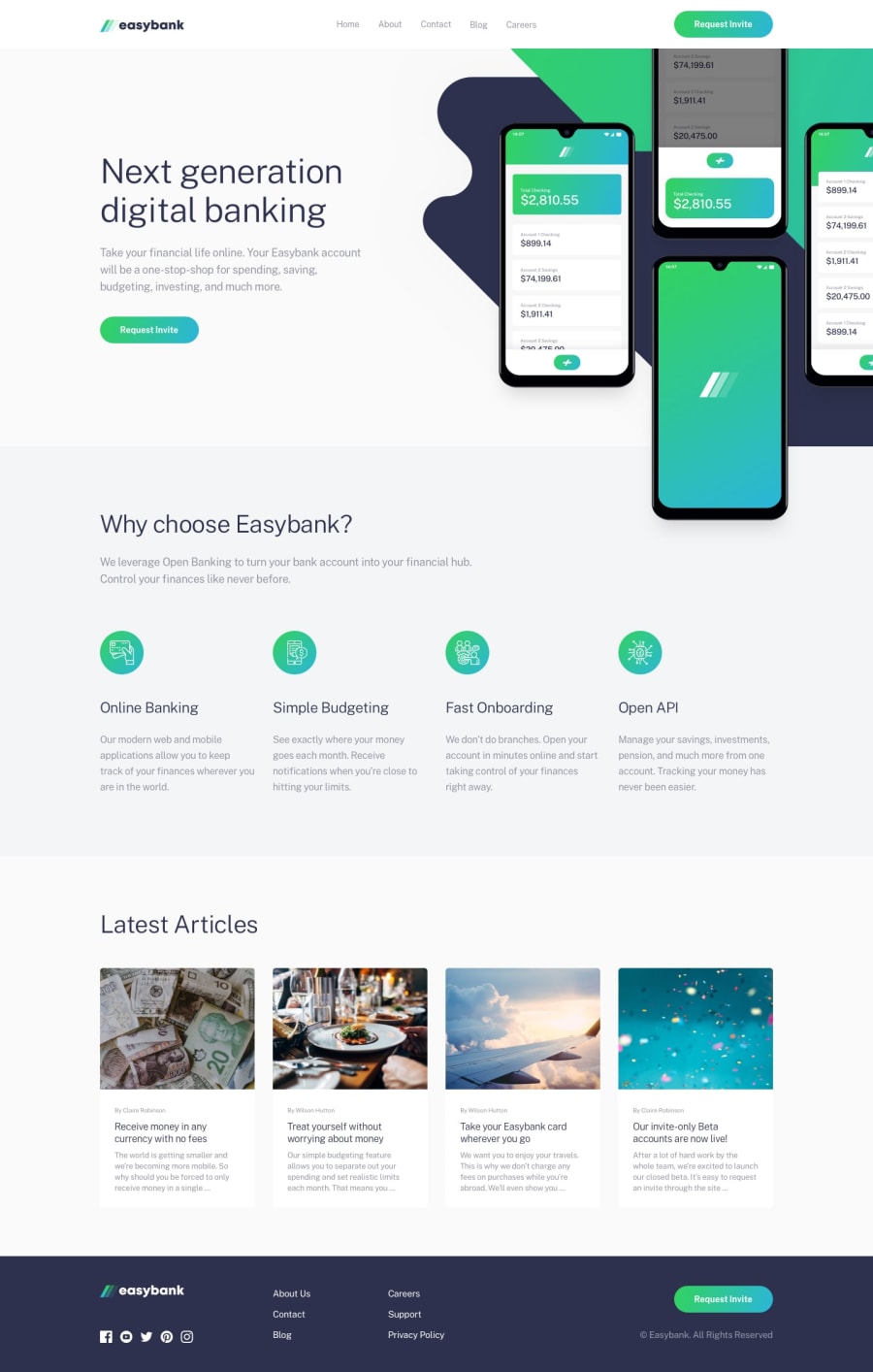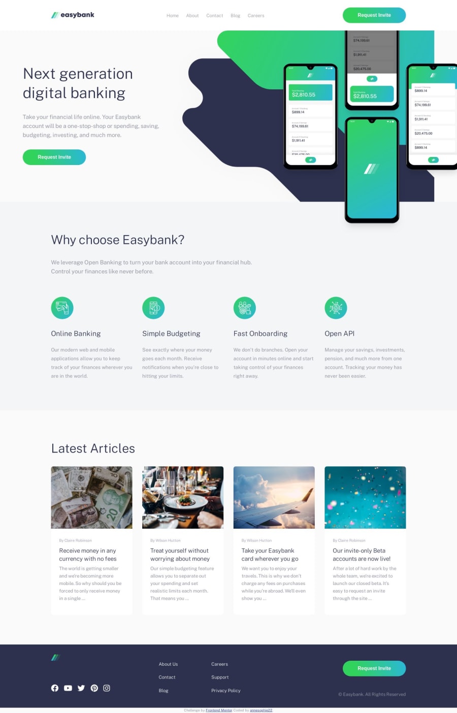
Design comparison
Solution retrospective
Oh my god this one was really hard - and far from being perfect.
2 questions for you :
-
Any idea on how to add a bottom border effect on a link:hover, with the border color GRADIENT ? I tried border-image-source. It worked well on preview with VS Code live server, but now it is on Vercel, I got my link bordered on the 4 sides instead of bottom only...
-
Any genius who could explain me how to achieve the horizontal alignment of the hero section (the one with the smartphone mockups) ? I managed to get the desired design at 1440px, but whenever your screen is bigger then the hero container get bigger too and it's crap. On the other end, if I set up a fixed max-width to the hero section, then the mockup and the background image (which are 2 different files provided with the challenge) will get aligned with the rest of the website, so I do not get this overflow effect.
I tried to get it a bit more responsive instead of having it good only for 2 resolutions. It was a really tough challenge for me !
Thanks for your answer and happy coding
Community feedback
- @zuolizhuPosted about 4 years ago
Hi Anne,
Good work on this solution 🥳. Its getting pretty close to perfect😝!
To answer your 2 questions:
- The border works properly on my browser, it only shows the bottom part. I just learned the new way to use border-image-source from your code 😆.
There are two ways I would do for the border. Instead of using border property, I would use ::after or add another div inside the <li></li>, just under a link. And then set the background to gradient, and control the "border" thickness with height. To do so, I could add some animations to display or hide the border smoother.
- To get the overflow effect, you can set the mockup image to position:absolute, and control the position with left and right properties.
By the way, the footer logo need to be white text. Otherwise it will hide in the background.
Happy coding!🙌
2@annesophie22Posted about 4 years ago@zuolizhu Many thanks for your answer !
-
Using ::before and ::after is not in my reflex yet - but that must definitely change ! I will try, many thanks for the tip. Using border-image-source was probably not the optimal thing (first time I use it) I've done since the design file shows that the bottom border should match with the bottom of the nav bar (which is not the case in my solution). So the idea of the div is actually also very good. I'll have to try this one out as well.
-
I think I spent the same amount of time trying to position this mockup and the background than coding the rest of the design... I must have tried 1 million different things - if I set the mockup as position: absolute, then the top of the image overflows the navbar on the top (the top of the upper smartphone should be visually under the navbar)... and if I put a z-index to the image, it disappears since it goes under its container...
I kind of gave up on this one - I thought that in "real life", the designer or even myself would have created the mockup to fit the design and not the other way around... Any way that also showed I still have a long road to go on my coding journey !
You're totally right about the logo in the footer. I tried to convert it to white with Photoshop but didn't work the first time I tried and I was so frustrated with my background and mockup image that I did not insist... The file is in SVG and according to my research you cannot change the color with CSS. I guess this is right ?!
Your feedback is very valuable, thanks for having taken the time to help !
0@zuolizhuPosted about 4 years ago@annesophie22 The layers of the mockup and background are very complicated, I totally understood your feeling 🤣 You mentioned the Photoshop, I think you can cut the mockup manually to create the overflow effect (This is kind cheating but it works🤪)
You do can change the filling color of svg using css. But an easier way to do the footer logo, is to copy the original logo.svg, and open the .svg file in Adobe XD or Figma (those are free to use), and then change the color.
I'm glad to help out and thanks for your upvote 😆
0
Please log in to post a comment
Log in with GitHubJoin our Discord community
Join thousands of Frontend Mentor community members taking the challenges, sharing resources, helping each other, and chatting about all things front-end!
Join our Discord