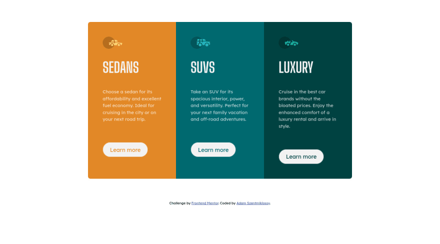
Design comparison
Community feedback
- @lukejansPosted almost 2 years ago
Looks great!
One thing I've learned that I think you'll thank me for in the near future is to change the way you set your font. You should never be setting your font size in pixels as this is considered bad practice and not as accessible. When setting font size in pixels it does not allow the user to change the font in their browser settings making it difficult for ppl who need bigger font to read.
Instead try:
font-size: 1rem;which is 16px. You can use this tool to convert rem to pxhopefully this helps and happy coding!
0 - @AdrianoEscarabotePosted almost 2 years ago
Hi Szentmiklóssy Ádám, how are you? I really liked the result of your project, but I have some tips that I think you will enjoy:
To centralize your component, we can do this:
body {
    margin: 0;
    padding: 0;
    display: flex;
    align-items: center;
    flex-direction: column; // just if the body has two child
    justify-content: center;
    min-height: 100vh;
}
To improve the code structure wrap this div:
<div class="attribution">with the semantic tag
footerThe rest is great!
I hope it helps... 👍
0
Please log in to post a comment
Log in with GitHubJoin our Discord community
Join thousands of Frontend Mentor community members taking the challenges, sharing resources, helping each other, and chatting about all things front-end!
Join our Discord
