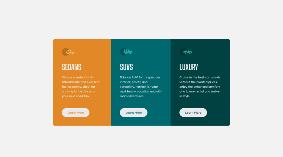
Design comparison
SolutionDesign
Solution retrospective
Feedback welcome I felt this one was easier? I don't know because I'm improving, but I had a lot of fun and I have a slight difficulty with the positioning of the cards and with the responsive part. I will try to study this part more in specific better
Community feedback
- @Bayoumi-devPosted almost 3 years ago
It looks great Anthony!...
My suggestions:
- Using more than one
<h1>is allowed by the HTML specification, but is not considered a best practice. Using only one<h1>is beneficial for screenreader users.
---> Multiple
<h1>elements on one page- I suggest you add
cursor: pointer;to the button, Thecursorindicates to users there is an action that will be executed when clicking on it.
Hope this help!... Keep it up👍
Marked as helpful1 - Using more than one
Please log in to post a comment
Log in with GitHubJoin our Discord community
Join thousands of Frontend Mentor community members taking the challenges, sharing resources, helping each other, and chatting about all things front-end!
Join our Discord
