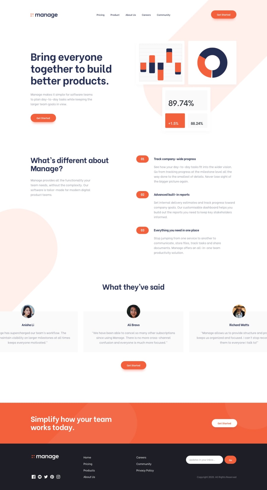
Landing page with animation, sounds, and some other effects ✨
Design comparison
Solution retrospective
This is my first big project, and I put a lot of time in on it. I only used HTML, CSS (with the preprocessor SASS) and Vanilla JS. Well, here is a brief outline of the site's functionality. You can read about it in more detail here.
- Testimonials' slider that is automatically moving. You can hover a mouse pointer on it to stop it. Also, you can choose which testimonial to read by clicking one of the dots below the slider;
- The input field in the footer will shake and change its border on the invalid input;
- Button sounds and animation;
- Different mobile and desktop designs.
So, that's it. As always, any feedback is very welcome! 🙂
Community feedback
- @akshay63Posted almost 4 years ago
Hi @BONREY. The site is looking great. The sounds of each button and the animations are amazing. I just want to say that when we view the site in the mobile version, the navigational menus are aligned in an inconsistent manner. But otherwise, all your work is Great! Congralutions👌👌
1@BonreyPosted almost 4 years agoThank you for your feedback! I'll definitely fix that little bug 😉
0
Please log in to post a comment
Log in with GitHubJoin our Discord community
Join thousands of Frontend Mentor community members taking the challenges, sharing resources, helping each other, and chatting about all things front-end!
Join our Discord
