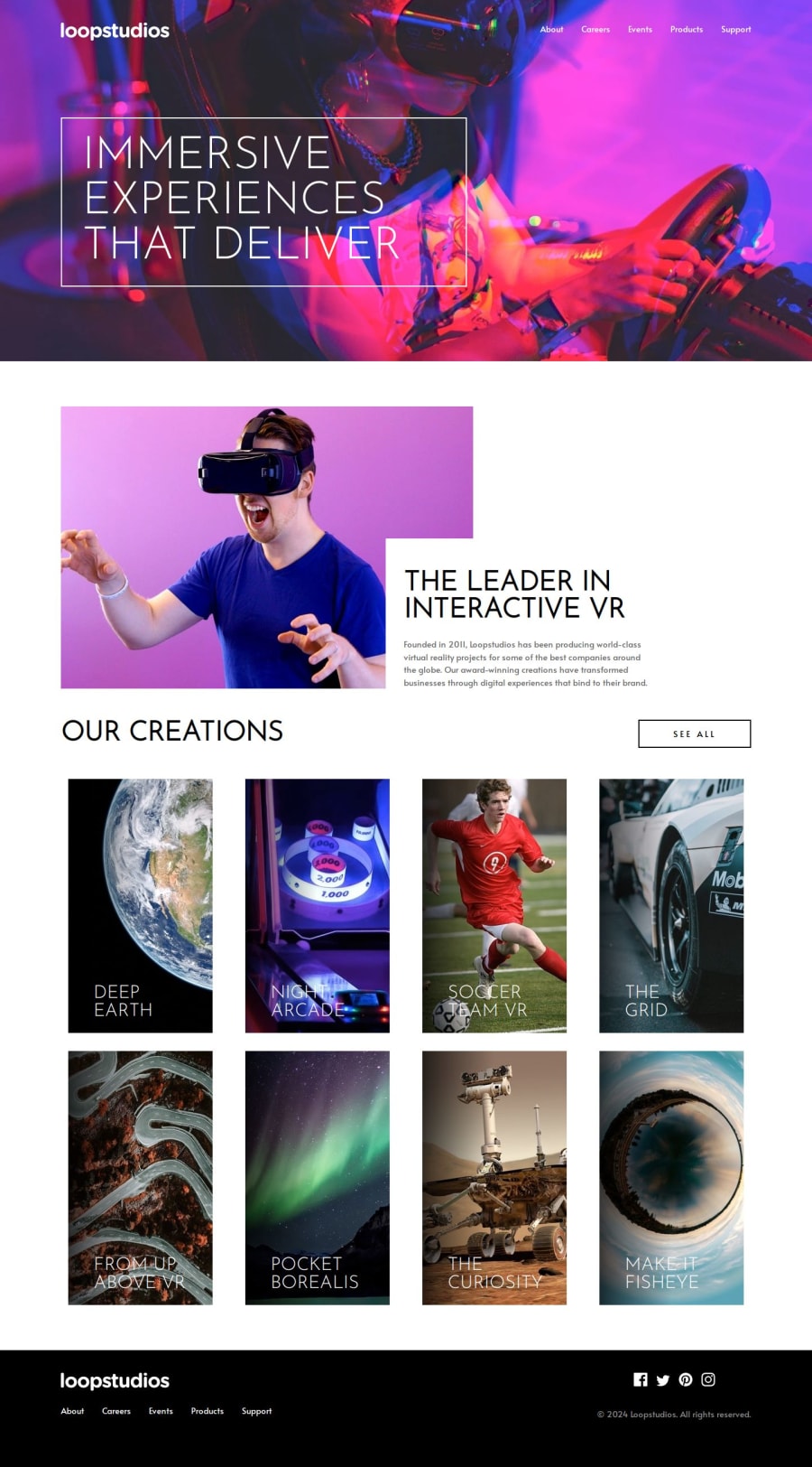
Design comparison
SolutionDesign
Solution retrospective
What are you most proud of, and what would you do differently next time?
This was a long but fun challenge. Added a small on hover animation. While writing this, probably i should give the body a max-width but that will affect especially the background image. I will consider it next time.
What specific areas of your project would you like help with?Any feedback is appreciated but i would especially like to get feedback about accesibility, semantics and grid.
Join our Discord community
Join thousands of Frontend Mentor community members taking the challenges, sharing resources, helping each other, and chatting about all things front-end!
Join our Discord
