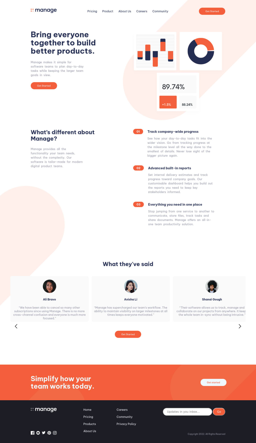


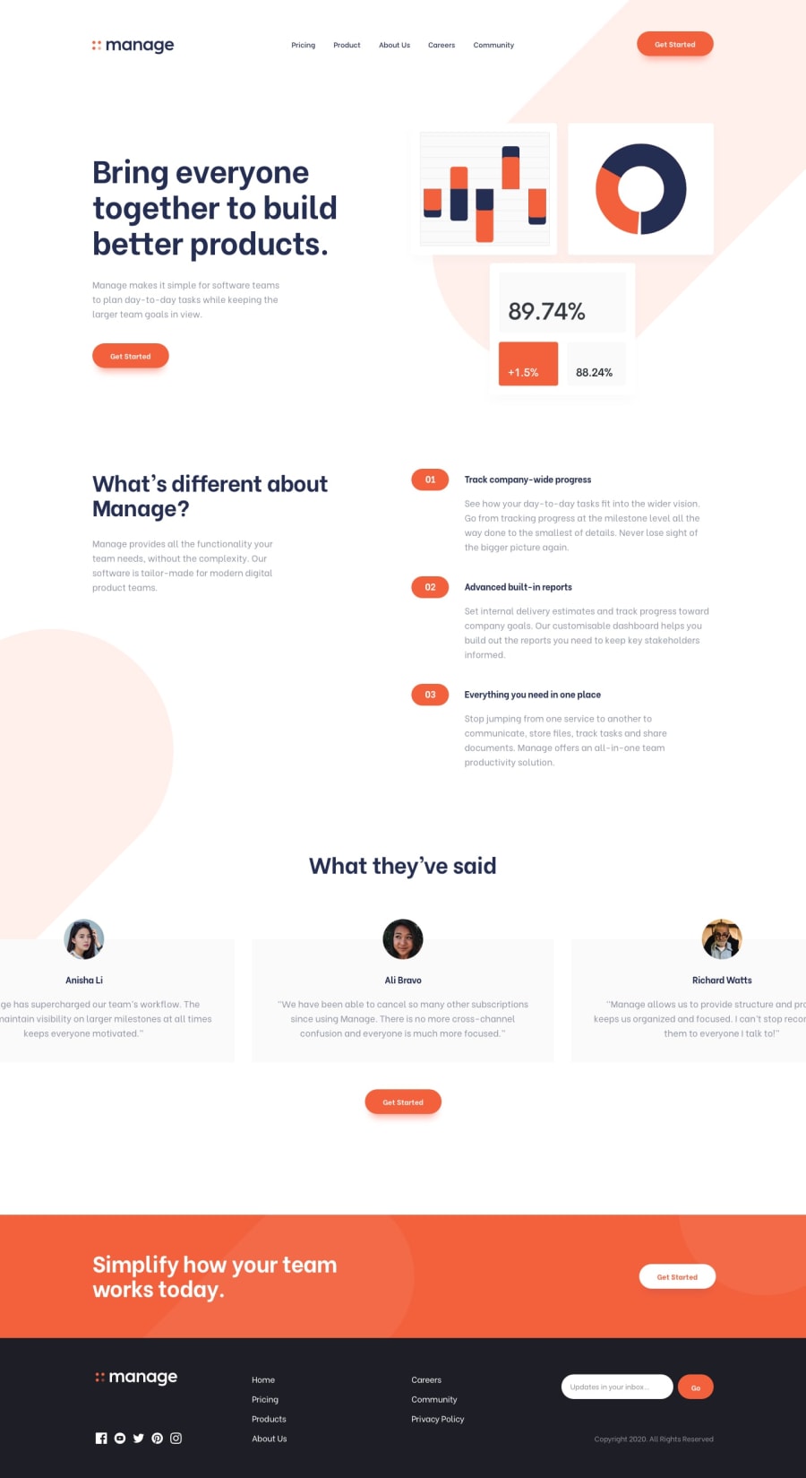
Design comparison
Solution retrospective
**The problems I had:**
1.Everything javascript. I found both the REview carousel, and the pop-up mobile navigation menu seriously challenging. I think i can make both of those elements much better with practice, but this time, i couldn't figure it out. (For the carousel; you need to click it first, then use the left/right arrows to make it move) 2.Putting the big orange ellipse/stadium thing in the back ground. I couldn't make it responsive to screen size. Not even mentioning the hard time i had to just put them there😅. 3.The email submit section at the footer. I made an input email type, but im not sure it's really functioning as it should. The only error it shows is when you dont input the "@" character. 4.I wasn't sure how to make the List item(Track company-wide progress, Advanced built-in reports, Everything you need etc..) match the mobile verison of the screenshot design. So i decided to keep "desktop design". 5.I have no clue how to make the avatars on the review carousel pop-out of the grey div, and be halfway outside. So I just wrapped the entire review in a block. 6.The logo dissapears whe you open the navigation menu on mobile.
Please log in to post a comment
Log in with GitHubCommunity feedback
No feedback yet. Be the first to give feedback on Simon's solution.
Join our Discord community
Join thousands of Frontend Mentor community members taking the challenges, sharing resources, helping each other, and chatting about all things front-end!
Join our Discord