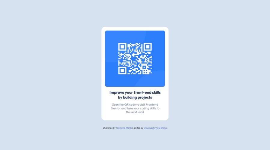
Landing page on the frontend mentor QR code challenge


Design comparison

Solution retrospective
I'm proud that I got to build a page using flex layout which was really hard for me to grasp. Next time, I will try to make it well aligned.
What challenges did you encounter, and how did you overcome them?One of the difficulty I experienced was on the layout and I overcame it by learning and using flex layout.
What specific areas of your project would you like help with?I'll need help with ideas on how to center the page vertically.
Please log in to post a comment
Log in with GitHubCommunity feedback
- @martinorue
Hi 👋
For the
.containerit is recommended to usemax-widthinsted ofwidthso that by shrinking the width of the screen, the width of the container is flexible. Check out thisIn this case I think that you don't need to add height in
.qr-code-imagebecause when you use width in an<img>by default the height will beheight: auto. And this is useful because you don't lose the aspect-ratio when you increase the image width.On the other hand, you added
width: 100%to the<h1>but you don't need that because de<h1>element isdisplay: block. And doing so can cause you problems, check out this. And maybe you wanted to usepaddinginstead ofmarginto add space to this element.Hope this helps
Marked as helpful - @BernardusPH
Hello ONYINYECHI VIOLA OBIKA.
To explain about the view port height and width well you cant just use a 100% on something which parent does not even have a width or height to begin with, remember that the element with
width:100%will take on the entire width of itsparent.Here, in this scenario the body is already at 100%
widthwithout even declaring it so we can ignore the width part and just focus on the height. If you want the body to be at the FULL screen size then you can use one of the following 2 ways:html,body{ height:100%; } /* OR */ body{ min-height:100vh; }I personally love the second option. The
min-height:100vhwill set the body height to at least be as big(in height) as the screen you are using. Both will work in your projecthope this helps
Marked as helpful - @Hassiai
Replace <div class="container"> with the main tag and <h3> with <h1> to fix the accessibility issues. click here for more on web-accessibility and semantic html
There is no need to give the body a width value. To center .container on the page using flexbox, replace the height in the body with min-height: 100vh.
There is no need to give .container a height value. increase the width of .container for it to be equivalent to the width of the design.
width:320pxGive the img a max-width of 100% instead a width and height value.Give h1 and p the same font-size of 15px and the same margin-left, margin-right and margin-top values. Give p a margin bottom value.
Use relative units like rem or em as unit for the padding, margin, width values and preferably rem for the font-size values, instead of using px which is an absolute unit. For more on CSS units Click here
Hope am helpful.
Well done for completing this challenge. HAPPY CODING
Marked as helpful


Join our Discord community
Join thousands of Frontend Mentor community members taking the challenges, sharing resources, helping each other, and chatting about all things front-end!
Join our Discord