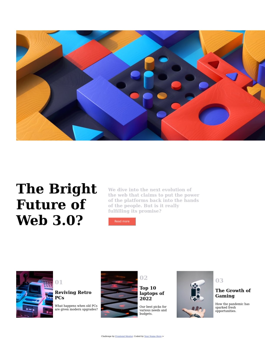
Design comparison
Solution retrospective
I had a hard time with the header. It still looks like garbo, but I tried. I was unsure of exactly how i wanted the button to open the menu to act. I should've done mobile first design, because my code is a nightmare to look at. I probably could've done it in less code.
Community feedback
- @FrostemanNeogardPosted over 1 year ago
There's definitely some good stuff here!
Firstly, you are using CSS variables which I see a lot of people miss quite often. The desktop layout is there, and the hover effect on the "New" section works as it should.
Here are some things that hinder you quite a bit:
- A lot of your
widthandheightvalues are hard-coded in pixels. Doing this for properties such asmin-widthandmin-heightis quite common (and important), but for layouts such as this, it's gonna be incredibly hard to have stuff display properly that way. You could try playing around with viewport values such asvw(viewport width),vh(viewport height), as well asvminandvmax. - There seem to be a couple things that simply were forgotten, such as importing the font given in the starter code, though I do see that you do have a variable for the font family which is great! There are also a couple missing hover effects and the logo in the top left is missing.
I can highly recommend designing for mobile viewports first, then expanding to the desktop view after that. I've recently started doing this and I've found it to be quite a bit easier. You might know this already, but you can press
ctrl+shift+min your browser to bring up "responsive design mode" where you can easily scale your window to specific sizes.Hope this helps!
0 - A lot of your
Please log in to post a comment
Log in with GitHubJoin our Discord community
Join thousands of Frontend Mentor community members taking the challenges, sharing resources, helping each other, and chatting about all things front-end!
Join our Discord
