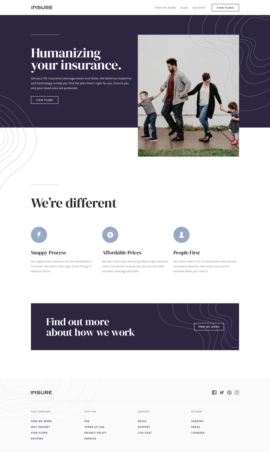
Design comparison
Solution retrospective
Hey everyone, I've been looking for CSS frameworks to learn and I've tried Tailwind and loved it, the docs really helped me find almost all of my answers. The only thing I couldn't do was the menu animation, so that will be my attention for future projects.
Happy Coding!
Community feedback
- @visualdennissPosted over 1 year ago
Your implementation looks amazing on all browser sizes! Congrats on completing the challenge successfully :)
Regarding your question about animating the mobile menu: It is tricky to animate it from display:block to display: none. The usual trick is the either make the nav slide in to the page from side or from top of the page. This can be usually done either by manipulating the width (for horizontal slide) or height (for vertical slide) from 0 to its final height or width or positioning it out of the viewport, here is an example:
    .mobile-navbar {
        position: fixed;
        top: 0;
        right: -300px;
        width: 300px;
        height: 100vh;
        transition: all 0.3s ease;
    }

    .active {
        right: 0;
    }
and by using JS, u can toggle between the classLists.
Hope this helps! :)
Marked as helpful1@reginaguermandiPosted over 1 year ago@visualdenniss Hi Dennis, I managed to implement your tips and it worked out super well. I spent a whole day doing this? Yes! But it worked. lol
I also changed the javascript to toggle instead of add and remove and it was much more organized and less repetitive.
I appreciate your help! ;D
1@visualdennissPosted over 1 year ago@reginaguermandi Oh thats great to hear! It must have been quite a productive day :) I've checked and ur navbar seems to work like a charm, so congrats on that and good luck on ur next projects!
0
Please log in to post a comment
Log in with GitHubJoin our Discord community
Join thousands of Frontend Mentor community members taking the challenges, sharing resources, helping each other, and chatting about all things front-end!
Join our Discord
