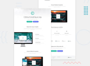
Design comparison
SolutionDesign
Solution retrospective
Hi there, I think this is an advance for me. Any feedback?
Community feedback
- @vanzasetiaPosted almost 3 years ago
Hello, Lucas! 👋
Congratulations on finishing this challenge! 👏
If you think that this is too hard, I would recommend doing the component challenges first.
Here is some feedback from me:
- Accessibility
- Alternative text for images should not contain any words that related to image (e.g. picture, photo, logo, icon, graphic, avatar, etc). It's already an image element so the screen reader will pronounce it as an image.
- Alternative for the logo should be the company name, which in this case, Clipboard.
- The intro section should live inside the
mainlandmark. Theheadershould only contain the logo. The intro section is commonly known as hero section. - There should not be text in
spananddivalone; instead wrap the text with a meaningful element. - In this case the download buttons should be link elements with the
downloadattribute. - Create a custom
:focus-visiblestyling to any interactive elements (button, links,input,textarea). This will make the users can navigate this website using keyboard (by usingTabkey) easily. - Next time, if you are going to use
buttonelement, always specify thetypeof thebutton. It's going to prevent the button from behaving unexpectedly. - The first section and the second should only be a section. Also, make the list of features as
uland wrap each item withli. - The Quick Search, iCloud Sync, etc should not be headings. The content below each of them is too small. You might find it helpful if you think of a heading like a title on a document.
- The companies images are important content. It tells the user that these are the companies that use the product. Use the company's name as the alternative of each image.
- I would suggest always having a value for the
hrefattribute. In this case, use either a forward slash or#. - Link element must have text content as the label of it. The social media links don't have any text content so you could either add
aria-label="Facebook"or put a<span class="sr-only">Facebook</span>inside the link.
- Styling
- Currently on
500pxwidth, the download buttons are too close to each other.
- Currently on
- Best Practice (Recommended)
- Remove the commented code. If another developer (it can be you in the future) wants to improve this solution, he/she might get confused about whether or not the commented code should be used or deleted.
- I would recommend writing the styling using the mobile-first approach. It often leads to shorter and better performance code. As a result, mobile users will no longer be required to process all of the desktop styles.
That's it! Happy coding! 😁
0 - Accessibility
Please log in to post a comment
Log in with GitHubJoin our Discord community
Join thousands of Frontend Mentor community members taking the challenges, sharing resources, helping each other, and chatting about all things front-end!
Join our Discord
