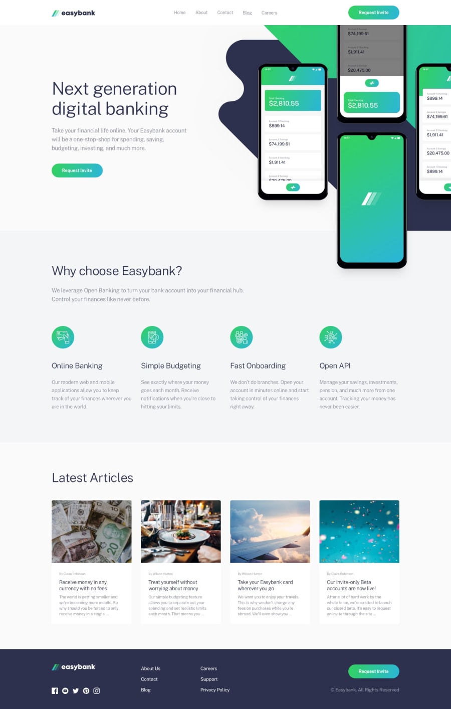
Design comparison
Solution retrospective
The appearance of the nav links, in the mobile menu navbar, is quite sudden, any suggestions to make it smoother?
Community feedback
- @yasssuzPosted over 3 years ago
Hey, Andy's.
Good job! But I find some things that you should change:
- after 1440px the website collapse because of the media query, I was looking at the code but I don't know why you have a media query with the max-width at 1440px. I could try to help you if you explain this to me.
- about the navbar, you could make it appear on the screen smoothly putting
visibility: hidden; opacity: 0; transition: all 0.3s ease;and when activevisibility: visible; opacity: 1;
happy coding and if I was helpful please upvote my comment :)
2@AndreanaPerlaPosted over 3 years agoHi @Galielo-App! Thanks for your feedback!
About the media queries, I set the requested ones (1440 and 375) and few others ...I didn't think about the highest queries or tablets...I guess I have to pay more attention to these things too TT_TT
About the navbar I already tried the solution you propose but for some reason it did not work...
0@yasssuzPosted over 3 years agoHello @AndreanaPerla
About the media queries, you could use the mobile-first approach using min-width to avoid this type of bug and cleaner code. Remember, it's very important to make your website responsive.
and about the navbar, here a few things:
- on the mobile toggle don't use a div, use a nav, it's better for screen readers to understand what's happening on the screen.
- your mobile nav it's not centered, no problem! It's easy to fix, on
@media only screen and (max-width: 375px) #links.showthe left should be 50%, thewidth: 90%and you should add `transform: translateX(-50%). This will align your nav to the center and will work on smaller screens as well. It's responsive!!! - and for the navbar animation, well it's a little buggy, idk why. You could partially solve this by adding
opacity: 1;visibility: visible;to the@media only screen and (max-width: 375px) #links.showand then addingopacity: 0;visibility: hidden;to@media only screen and (max-width: 1440px) #links, and make sure to remove thedisplay: none;
happy coding and if I was helpful please upvote my comment :)
1@AndreanaPerlaPosted over 3 years agoIf there is something I am learning, it is that mobile-first approach is always the right choice!
I'll work on the changes (thanks also to your suggestions!) as soon as possible :)
Thanks again @Galielo-App >_<
1@yasssuzPosted over 3 years ago@AndreanaPerla you're welcome, for any questions I'm here :)
1
Please log in to post a comment
Log in with GitHubJoin our Discord community
Join thousands of Frontend Mentor community members taking the challenges, sharing resources, helping each other, and chatting about all things front-end!
Join our Discord
