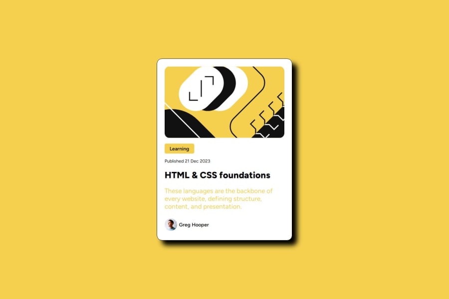
Design comparison
Solution retrospective
i went to do something more complexe
What challenges did you encounter, and how did you overcome them?yes
What specific areas of your project would you like help with?test
Community feedback
- P@Islandstone89Posted about 1 year ago
HTML:
-
Headings should always be in order, so you would never start with a
<h2>. Also, "Learning" is not a heading but a<p>. -
Use the
<time>element for the date. like this:<p>Published <time datetime="2023-12-21">21 Dec 2023</time></p>. -
As this is a blog card, add a link inside the heading.
-
The profile image needs a short, descriptive alt text, like "Headshot of Gary Hooper".
-
Change "Gary Hooper" to a
<p>.
CSS:
-
Including a CSS Reset at the top is good practice.
-
Add around
1remofpaddingon thebody, so the card doesn't touch the edges on small screens. -
On
main, changeheighttomin-height- this way, the content will not get cut off if it grows beneath the viewport. -
Remove the
widthon the card. -
Add a
max-widthof around20remon the card, to prevent it from getting too wide on larger screens. -
Paragraphs have a default value of
font-weight: 400, so there is no need to declare it. -
The text in
.card-descriptionhas low contrast, so I would change it to black for better readability.
1 -
- @lij110397Posted about 1 year ago
- I like the name standard of the class. It gives lots of meanings and the code is neat.
<div class="card"> <h2 class="card-category">Learning</h2> <div class="card-author"> <h3 class="card-author-name">Greg Hooper</h3>- The box shadow of the card is different from the design.
box-shadow: 1rem 1rem 1rem rgba(0, 0, 0, 1);The third parameter should be changed to 0, which control the blur range.
0
Please log in to post a comment
Log in with GitHubJoin our Discord community
Join thousands of Frontend Mentor community members taking the challenges, sharing resources, helping each other, and chatting about all things front-end!
Join our Discord
