Submitted about 4 years ago
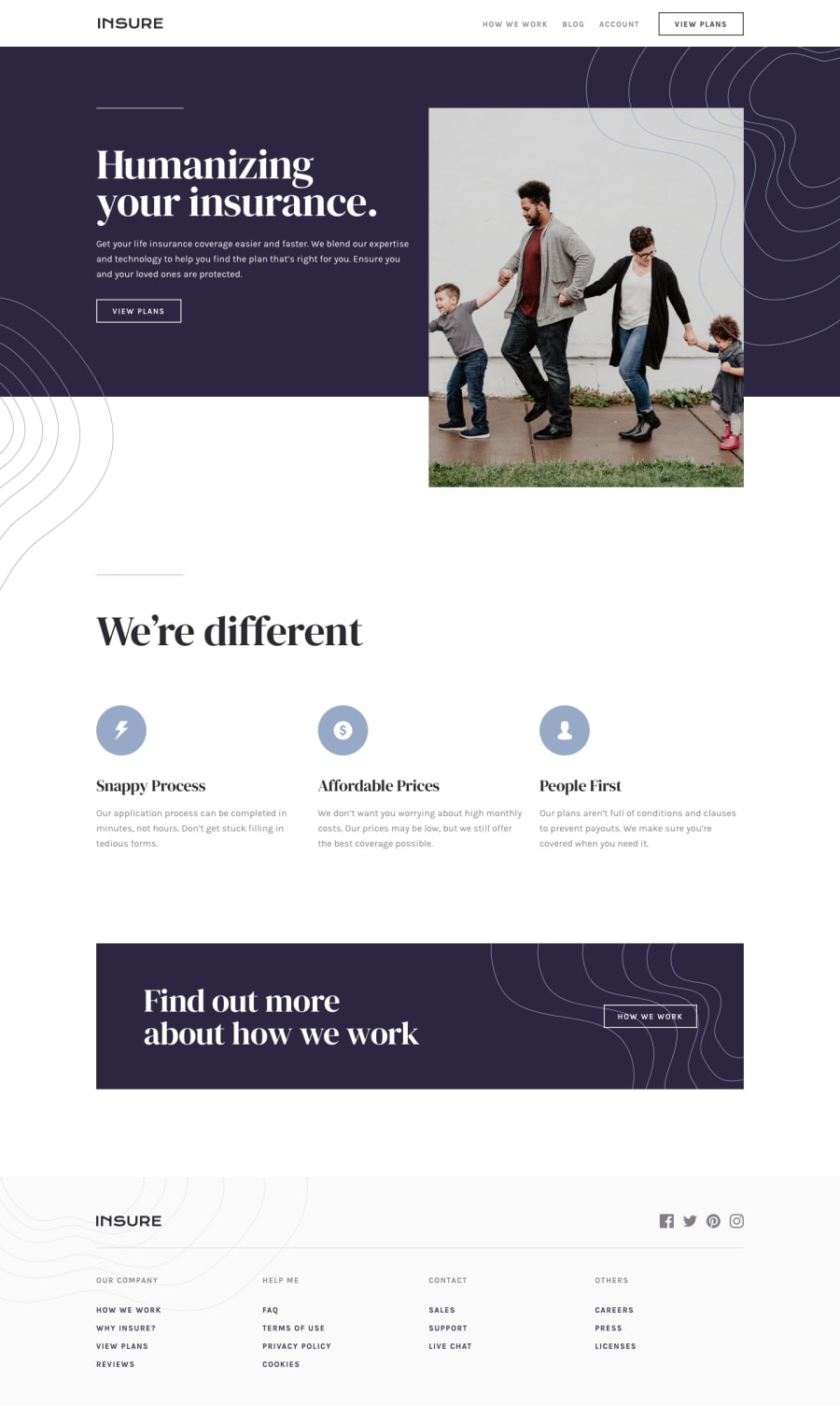
Landing page built using Vanilla JS, HTML, and CSS
@cjislegit
Design comparison
SolutionDesign
Solution retrospective
I am open to any feedback, but I am particularly looking at the responsiveness of the site. I did my best to make it responsive, but I am sure there are ways to improve.
Community feedback
- @emestabilloPosted about 4 years ago
Hi Carlos, great work on finishing this challenge! I know it isn't as easy as it looks :-) Here are a few points:
- The site looks responsive in a way that nothing is causing overflow, but I think you can switch the hero section to desktop mode before 1200px. The image is quite large at that point, and there is more than enough space to stretch out the footer.
- For the hover states: they only work on desktop, and the links on the mobile menu seems to have a different hover effect than the design. The footer links are not hoverable at all (and should be left aligned in desktop layout).
- Minor tweaks for font colors and sizing, and adjusting the desktop nav to be in line with the the rest of the body content should all make the project closer to the design
Hope this helps!
1@cjislegitPosted about 4 years agoThank you for the feedback! Definitely will be implementing your suggestions.
1
Please log in to post a comment
Log in with GitHubJoin our Discord community
Join thousands of Frontend Mentor community members taking the challenges, sharing resources, helping each other, and chatting about all things front-end!
Join our Discord
