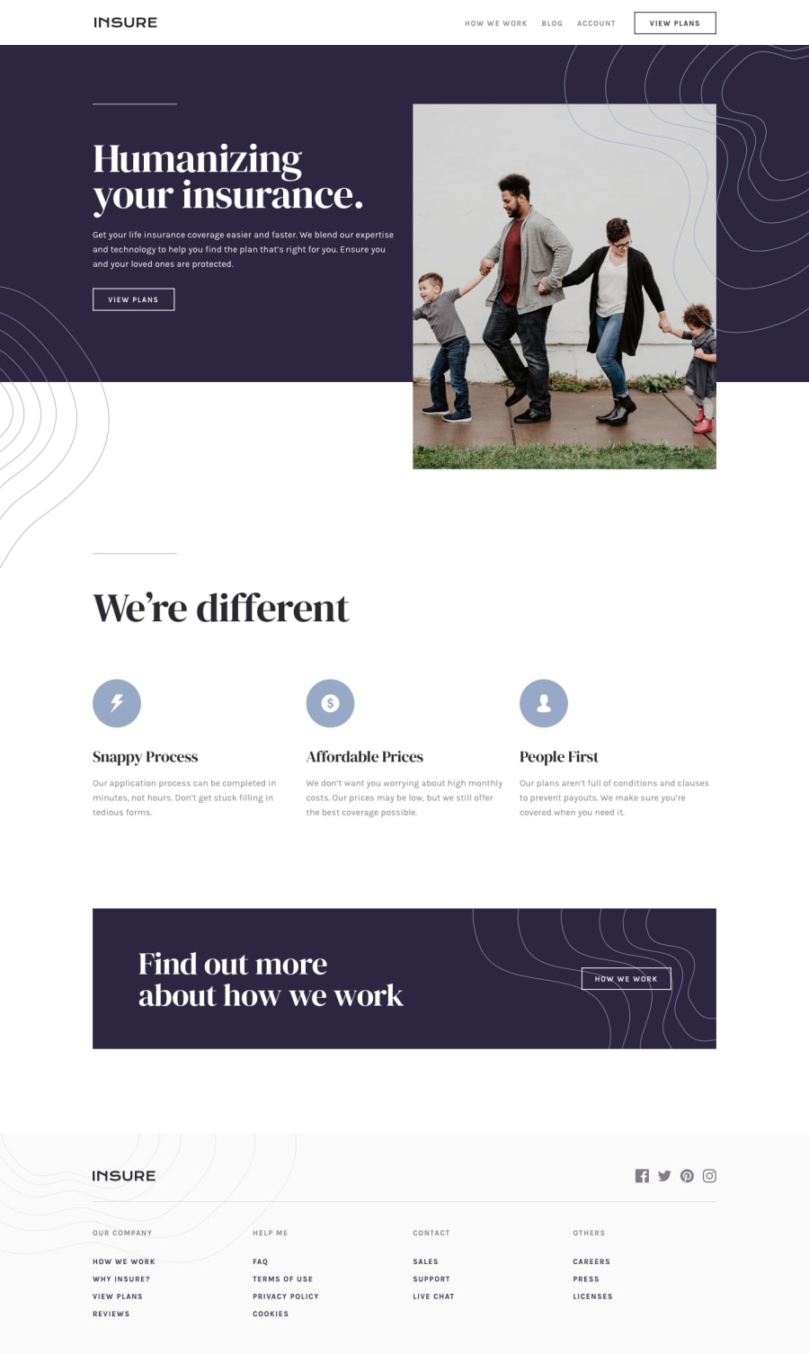
Design comparison
Solution retrospective
Hi Everyone, any comment are welcome. happy coding!!
Community feedback
- @pikapikamartPosted over 3 years ago
Hey, great work but there are couple of concerns.
-
The view plan button seems not to work because even if I hover on it, nothing, I inspected it and cant seem to locate it, so I had to manually see it locate it, per element. But still can't get any access to it in the browser. You might want to check that one out.
-
Console is prompting an error regarding your path declaration in the footer image . You specified it like this
background: url(../insure-landing-page-master/images/bg-pattern-footer-desktop.svg);but I looked into your repository but cant seem to find those folders. Your declaration should only beenbackground: url(bg-pattern-footer-desktop.svg);for the image to render properly -
When resizing, your contents gets cutted of by the viewport, especially the hero image which does not scale that is why there is also an screenbar at the bottom of the screen. The footer contents are also cut out as well. Refactoring those will be really good.
Apart from that, still, points for creating. The mobile view is fine. Just those mentioned above really needs actions okay^
1@DcatnisPosted over 3 years agohi @pikamart thank you for your comment and suggestions, I will try to change the code, thanks and happy coding
0 -
Please log in to post a comment
Log in with GitHubJoin our Discord community
Join thousands of Frontend Mentor community members taking the challenges, sharing resources, helping each other, and chatting about all things front-end!
Join our Discord
