


Design comparison
Solution retrospective
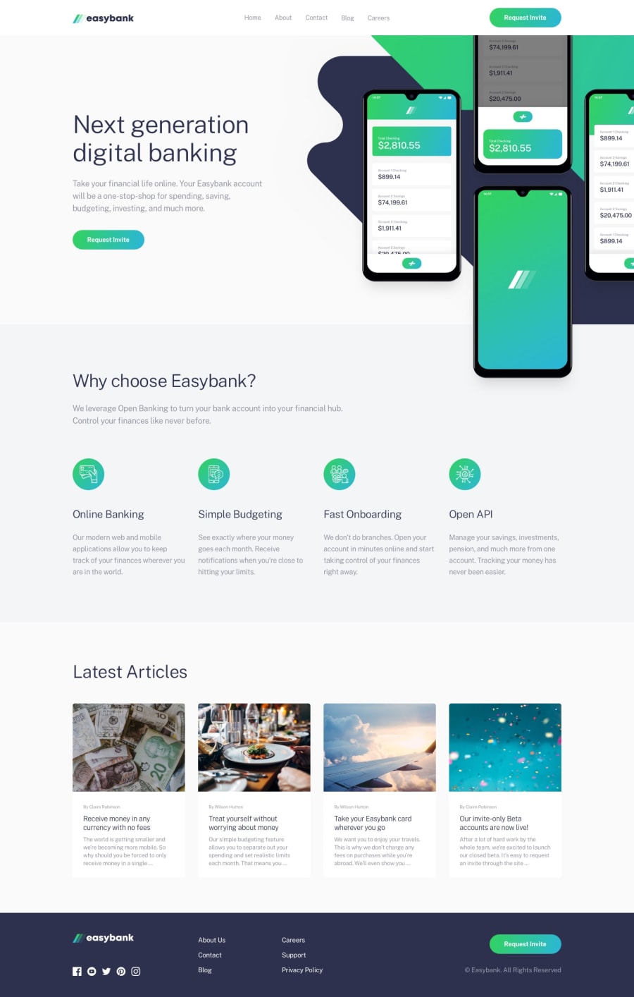
I could not make it responsive. Because in second part of page with background image and mobile phone images must be at top of div at responsive design. But i made its div with left text as display:flex; So i can not position image to top in div. So i did not make responsive design of page. Anyway i hope you like. Comments below please.
Community feedback
- @d3bu6m3Posted about 2 years ago
do you know that you can use flex 'order' to change the order number of flex items? if you do the mobile first approach the image is in the top of the text so when it comes to desktop if you will use flex the image will be in the left and the text will be on the right, to arrange their position you can use order: 1; for text and then order: 2; for the image so they will swap position, the image will be on the left part by doing this order. You can also use CSS Grid it can help you alot when positioning elements to the corresponding place
0@vedatsozenPosted about 2 years ago@d3bu6m3 You are right. Thank you. I now remembered it.
flex-direction: column-reverse;
or row-reverse;
I will use it.
I like flex.
I don't use grid so much.
0@d3bu6m3Posted about 2 years ago@vedatsozen flex-direction is also a different thing, you can search for 'order'
0

Please log in to post a comment
Log in with GitHub
Join our Discord community
Join thousands of Frontend Mentor community members taking the challenges, sharing resources, helping each other, and chatting about all things front-end!
Join our Discord