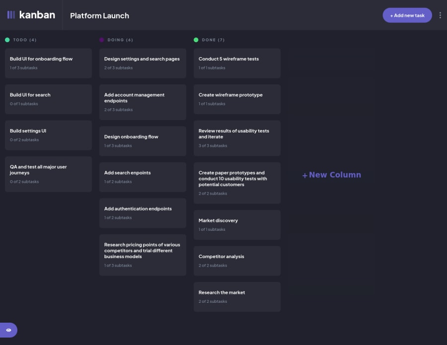
Kanban Tasks (CSS Grid, Flexbox, Sass, Redux-Toolkit, Redux-persist)
Design comparison
Solution retrospective
This was a tricky project, with lots of different decisions to be made, for instance the mobile version of this project, on the design, the dashboard doesn't change and keeps going horizontally, which I feel was not the best design wise. In the future I might come back to change this but for now I wanted to stick to the design as best as possible.
This was the first time I had to implement a drag and drop feature in a project and it worked well unit I had to update the status of the item, to the column name, the item was dragged to. It still works, but it seems to be more temperamental that it should be. This is something I will come back to fix in the future.
Any and all feedback on this project would be greatly appreciated, Thank You!
Community feedback
Please log in to post a comment
Log in with GitHubJoin our Discord community
Join thousands of Frontend Mentor community members taking the challenges, sharing resources, helping each other, and chatting about all things front-end!
Join our Discord
