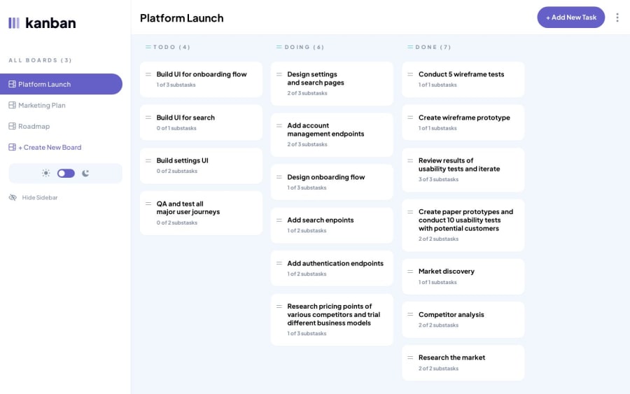
Kanban task management web app with SvelteKit
Design comparison
Solution retrospective
This challenge is the one that required the most amount of state management so far. Feedback would be much appreciated.
Community feedback
- P@CarlHummPosted over 1 year ago
Hi there Nazif
Well done on completing the challenge. It looks like a cool, but complex challenge that I hope to attempt sometime in the future after some study.
I noticed you set the following values
max-inline-width: 1440pxandoverflow:hiddenfor.layout svelte-j7s0ua(Grid Container)width: calc(100dvw - var(--sidebar-width))formain.with-sidebar.svelte-j7s0ua(Card area)
Header content being hidden by overflowing content
Because the card area is basing it's dimensions on the overall viewport, and the grid container has a set max-width of 1440px, this will cause the content to overflow and as such the header content will be spaced beyond the 1440px and clipped out of view.
To test this you could remove the width from
main.with-sidebar.svelte-j7s0uaor remove max-width from.layout svelte-j7s0ua.Other than this minor issue everything else functions well, I like the drag and drop feature. Unfortunately I'm not experienced enough to comment on state management or SvelteKit.
Good luck on future challenges
Marked as helpful1@nazifbaraPosted over 1 year agoHello @CarlHumm. Really thanks for your feedback 🙏🏽. I fixed the issue.
0
Please log in to post a comment
Log in with GitHubJoin our Discord community
Join thousands of Frontend Mentor community members taking the challenges, sharing resources, helping each other, and chatting about all things front-end!
Join our Discord
