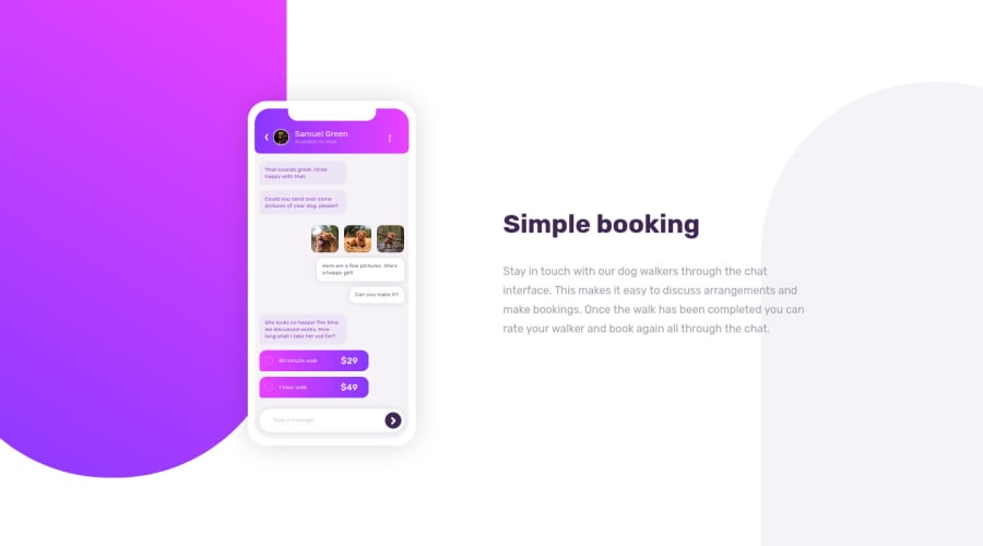
Just using pure css and js except with what they provided^^
Design comparison
Solution retrospective
Feel free to drop your comments or question regarding my solution^^
Community feedback
- @ApplePieGiraffePosted almost 4 years ago
Hey, Raymart Pamplona! 👋
Nice to see you complete another challenge! 😀 Good work on this one! 🙌 Your CSS illustration looks pretty good! 👍
One or two small things I suggest are,
- Giving the CSS phone a fixed width so that its size remains consistent across screen sizes.
- Making sure the content of the page remains centered in the viewport (even when the size of the screen decreases in the desktop layout).
- Switching to a mobile-friendly layout slightly sooner to prevent the paragraph to the right of the page from looking too squished right before the layout changes.
Hope that helps. 🙂
Keep coding (and happy coding, too)! 😁
1@pikapikamartPosted almost 4 years ago@ApplePieGiraffe Oh yes thank you for that. Maybe i'll just add a
min-widthto the phone so that it won't resize right. Gosh I forgot that hahaha and the content yes, they got squised. I'm so focused on creating the illustration a pixel perfect forgot that there are content that I need to give focus to as well. Well gonna refactor it and commit so that everyone can see. Thank you again for that^^1@ApplePieGiraffePosted almost 4 years ago@pikamart
Haha, no problem! 👍 I've done the same thing too, before! 😅 Keep going with these challenges! 😀
0 - @akshay63Posted almost 4 years ago
Hey, @Raymart Pamplona. It is looking great. 👍
0 - @pikapikamartPosted almost 4 years ago
Fixed the min-width of the illustration and already commited^^
0
Please log in to post a comment
Log in with GitHubJoin our Discord community
Join thousands of Frontend Mentor community members taking the challenges, sharing resources, helping each other, and chatting about all things front-end!
Join our Discord
