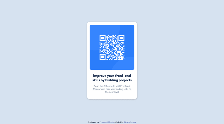
Design comparison
Solution retrospective
This is my 1st solution i am submitting to frontend mentor and it's a great platform. please review the solution and feel free to speak if found any mistakes.
Community feedback
- @ChamuMutezvaPosted almost 3 years ago
Well done Bickey. Some things to consider are semantic elements such as main. The main element is considered important as it contains the main purpose of the site. In this case you can change this div
class="QR-code"to the main element and the attribution div can be changed to the footer element.1@BickeykrPosted almost 3 years ago@ChamuMutezva thank you for your feedback. I will consider your suggestions & make changes.
0 - @NaveenGumastePosted almost 3 years ago
Hay ! Good Job Bickey
These below mentioned tricks will help you remove any Accessibility Issues
-> Add
Maintag after body like it should be your container. For 1st heading orh1tag, use header tag and then inside the header put yourh1orh2etc . But use header tag only once in main heading element.Keep up the good work!
1@BickeykrPosted almost 3 years ago@Crazimonk thank you, I will consider your suggestions & make changes.
1@BickeykrPosted almost 3 years ago@Crazimonk
hello there, can you help me here. if I change attribution div to footer element will it solve the accessibility issue which is in my solution.0
Please log in to post a comment
Log in with GitHubJoin our Discord community
Join thousands of Frontend Mentor community members taking the challenges, sharing resources, helping each other, and chatting about all things front-end!
Join our Discord
