

Design comparison

Solution retrospective
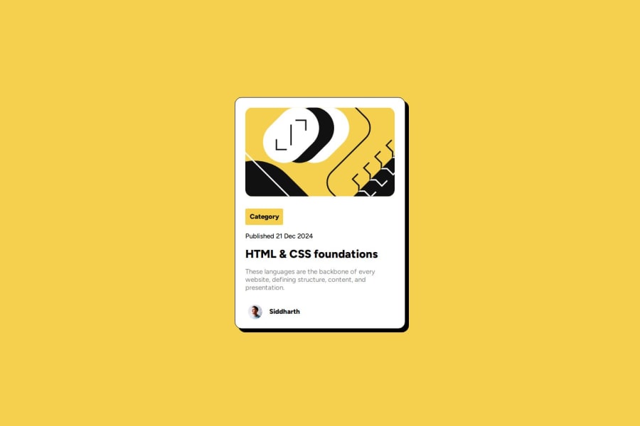
I did some style with flex and Also box-shadow was somthing new for me.
What challenges did you encounter, and how did you overcome them?I needed 1 div to the start but it was center but i managed with some negative margin in haste.
What specific areas of your project would you like help with?Styles stuff
Community feedback
- @thetinyelephant85Posted 11 months ago
Great use of Accessibility Landmarks. I will try to play around with responsive images and font-size as well and using variables declared as root.
Great job!
1 - @kristinakasalovaPosted 11 months ago
Hi,
looks great! Your card position is spot on. I noticed that you didn't change line height which changes the dynamic in the text bit of the card. Also, the category tag padding is a bit off, but these are minor bits. Although flex works fine, I wonder if you wouldn't get a bit better outcome in smaller screens using media queries, since the card is too wide in small screens. Maybe it's worth testing in your next project?
Well done and best of luck in your journey!
0


Please log in to post a comment
Log in with GitHubJoin our Discord community
Join thousands of Frontend Mentor community members taking the challenges, sharing resources, helping each other, and chatting about all things front-end!
Join our Discord