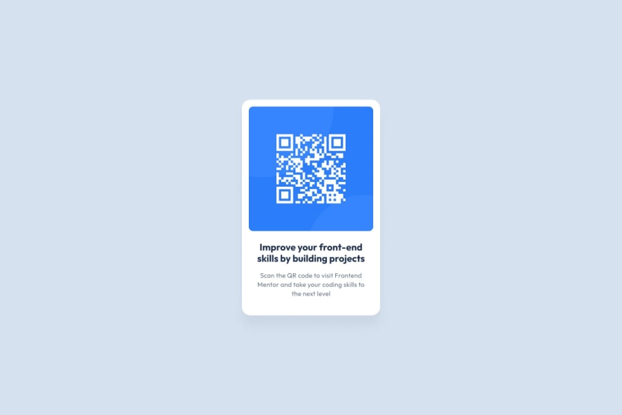
Design comparison
Community feedback
- @righigorPosted 8 months ago
Great work on the QR code component! The layout is responsive and closely matches the original design. To enhance your solution, consider incorporating more semantic HTML elements, such as using <main> for the main content and <figure> with <figcaption> for the image. These additions will improve both accessibility and structure. Additionally, while your current accessibility is solid, refining the alt text for images to be more descriptive can provide better context. Also, check the color contrast for readability, especially on mobile devices. Overall, your code is well-organized, but using CSS variables for colors and typography could improve maintainability and consistency. Keep up the great work!
1
Please log in to post a comment
Log in with GitHubJoin our Discord community
Join thousands of Frontend Mentor community members taking the challenges, sharing resources, helping each other, and chatting about all things front-end!
Join our Discord
