Solution retrospective
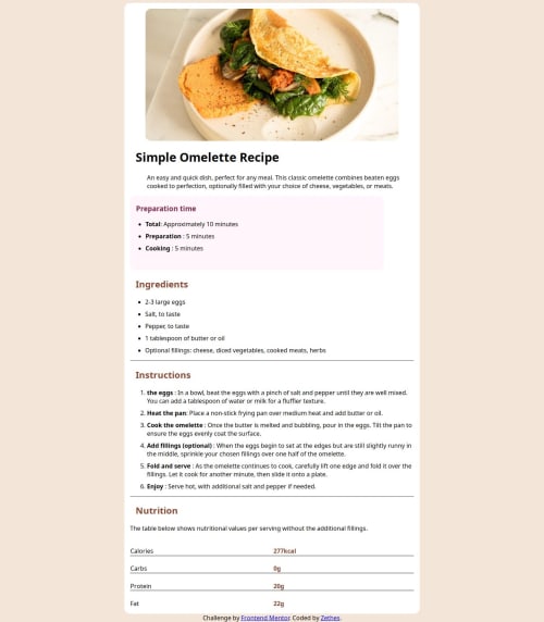
I’m most proud of successfully building the table and getting it to display correctly despite the challenges. Working with HTML tables was a significant learning experience for me, and overcoming issues with alignment, borders, and styling was particularly satisfying. I also feel good about my progress with basic HTML and CSS, as this project helped me solidify my understanding of these fundamental technologies.
Next time, I would focus more on ensuring the responsiveness of the design from the beginning. I initially struggled with making the layout work well on different screen sizes and would use media queries to address this more effectively. Additionally, I’d experiment with modern CSS techniques like Flexbox and Grid to handle complex layouts and alignments more gracefully. Improving my skills in these areas would help me create more polished and adaptive designs.
What challenges did you encounter, and how did you overcome them?- Table Formatting and Alignment
Challenge: One of the biggest challenges was working with HTML tables. Aligning elements properly and managing the borders and spacing proved difficult. The divider in the table kept getting segmented, and ensuring that there was no divider on the last row added another layer of complexity.
Solution: To overcome this, I spent time researching how to style tables effectively using CSS. I focused on understanding table-specific properties such as border-collapse, border-spacing, and border. I used the :last-child pseudo-class to handle the styling of the last row, ensuring it appeared correctly without unwanted dividers. Debugging with browser developer tools also helped me identify and fix issues with element alignment. 2. Responsiveness and Layout Adjustments
Challenge: I had trouble making the page responsive. Switching from px to rem units didn’t have the expected impact on the layout, and I struggled with implementing media queries effectively.
Solution: I realized that improving responsiveness required a combination of using media queries and refining the use of CSS units. I learned to apply media queries to adjust styles based on different screen sizes. I also experimented with Flexbox for layout adjustments to better handle different screen resolutions. 3. CSS Units and Layout
Challenge: Understanding the difference between px and rem units and their effects on layout was confusing. The layout didn't adjust as expected when changing units, which affected the overall design.
Solution: I researched and practiced using different CSS units and how they impact responsive design. I also reviewed tutorials and documentation on using rem for scalability and em for relative sizing. This helped me better understand how to use these units effectively in a responsive layout.
What specific areas of your project would you like help with?- Table Styling and Alignment
Question: I had significant issues with aligning table elements and managing borders and spacing, particularly with ensuring no divider appears on the last row. Can someone review my CSS for the table and suggest improvements or best practices for managing borders and spacing in HTML tables?
Details:
My CSS includes properties like border-collapse, border-spacing, and border.
I used :last-child to adjust styling for the last row but encountered issues with consistent spacing and alignment.
2. Responsive Design and Media Queries
Question: I struggled with making the page responsive. I tried using rem units and media queries but didn’t achieve the desired effect. Can someone provide feedback on how to effectively implement media queries for responsive design?
Details:
I used rem for font sizes and layout dimensions, but the design didn’t adapt well to different screen sizes.
I need guidance on crafting effective media queries to adjust styles for various devices and screen widths.
3. Using Flexbox and CSS Grid
Question: I’m interested in learning how to use Flexbox and CSS Grid more effectively for layout management. Can someone review my current approach and suggest how I could integrate these techniques to improve the layout and responsiveness?
Details:
My current layout is primarily handled with basic CSS.
I haven’t yet used Flexbox or CSS Grid extensively, and I’d like to know how these tools could help with alignment and responsive design.
4. General Code Review and Best Practices
Question: Can someone review my overall HTML and CSS code for best practices? I’m looking for advice on how to structure my code more effectively and any common pitfalls to avoid.
Details:
I’m still learning and would appreciate feedback on how to write cleaner, more maintainable code.
Please log in to post a comment
Log in with GitHubCommunity feedback
No feedback yet. Be the first to give feedback on Lord-Zethes's solution.
Join our Discord community
Join thousands of Frontend Mentor community members taking the challenges, sharing resources, helping each other, and chatting about all things front-end!
Join our Discord