

Design comparison

Solution retrospective
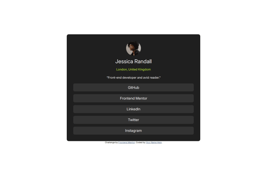
I did this one quicker than the last one, I'm improving
What challenges did you encounter, and how did you overcome them?Not really any challanges with this one actually
Community feedback
- @moaz-shamimPosted 6 months ago
Your Solution is completely different from the provided challenge design. Ensure the font-family: 'Inter' is properly imported into your HTML or via a CSS import, so it applies correctly. Issue: The .container class has fixed width (50%) and height (60%). This might cause layout issues on different screen sizes, especially on larger screens. Instead of fixed percentages, try using max-width and min-width with relative units (like rem) to make the container more flexible. Consider removing fixed height to let it grow naturally.
Accessibility Improvements: Add more descriptive alt texts and aria labels, and consider semantic elements to improve accessibility.
Consistent Styling: Move all styles from inline to external CSS to keep the code cleaner.
Functional Buttons: Convert the buttons to anchor links with proper href attributes so that users can easily navigate to the intended social media profiles.
0

Please log in to post a comment
Log in with GitHubJoin our Discord community
Join thousands of Frontend Mentor community members taking the challenges, sharing resources, helping each other, and chatting about all things front-end!
Join our Discord