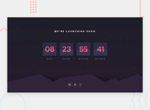
Design comparison
SolutionDesign
Solution retrospective
tried an effort with transform/rotate but didn't really cut it, be curious on suggestions
Community feedback
- @M-KgobePosted about 3 years ago
Hi... nice work on this
I suggest you increase your
.app'sheightto a100%, because now thebackground-imagejust looks a bit ugly.and you might also wanna adjust the
.hills-imgafterwards.Marked as helpful0
Please log in to post a comment
Log in with GitHubJoin our Discord community
Join thousands of Frontend Mentor community members taking the challenges, sharing resources, helping each other, and chatting about all things front-end!
Join our Discord
