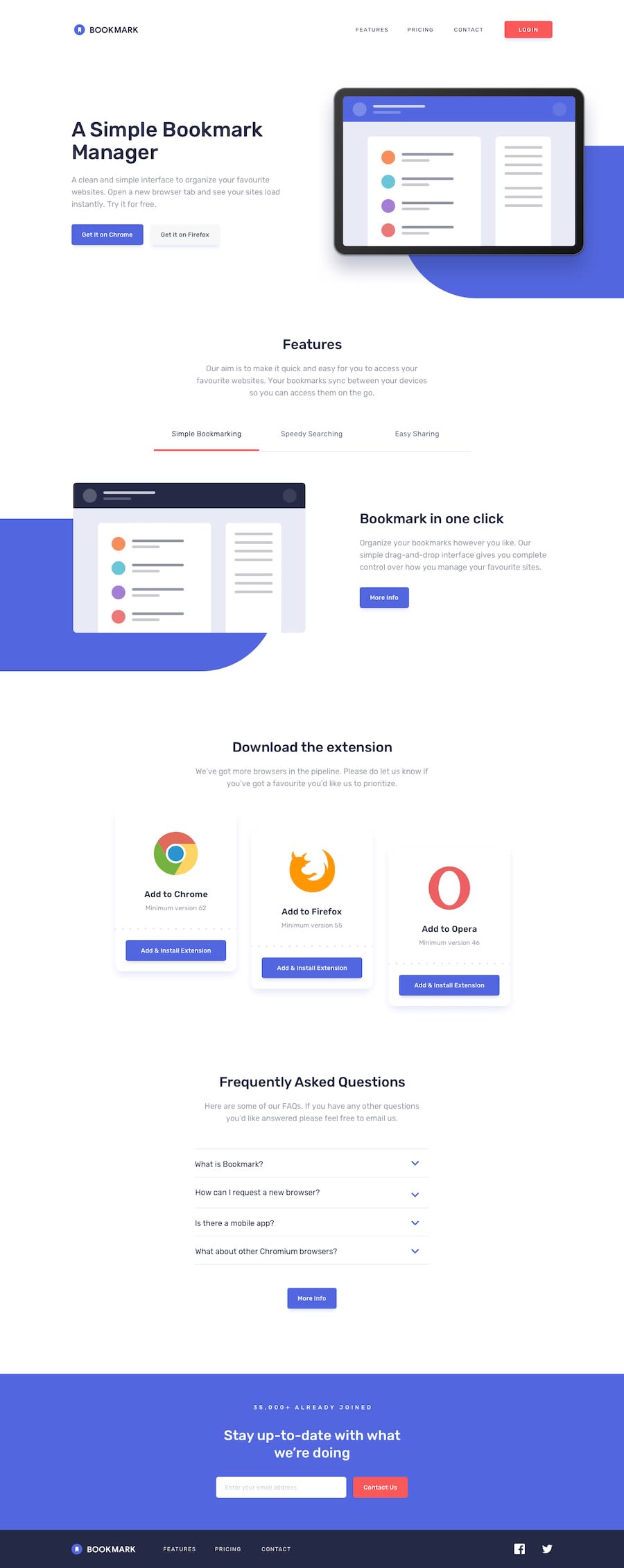
Design comparison
SolutionDesign
Solution retrospective
I would love some help on how to make my JS less verbose. Thanks!
Community feedback
- @mattstuddertPosted over 4 years ago
Hey Diarrah, awesome work on this challenge. Your solution looks really good and scales down well to mobile. For your JS, the main thing I'd recommend is having the content for the Features tab section in your HTML and then just toggling the right one based on the tab that is clicked. That would simplify your JS a bit. But overall it looks fine!
Keep up the great work 👍
1
Please log in to post a comment
Log in with GitHubJoin our Discord community
Join thousands of Frontend Mentor community members taking the challenges, sharing resources, helping each other, and chatting about all things front-end!
Join our Discord
