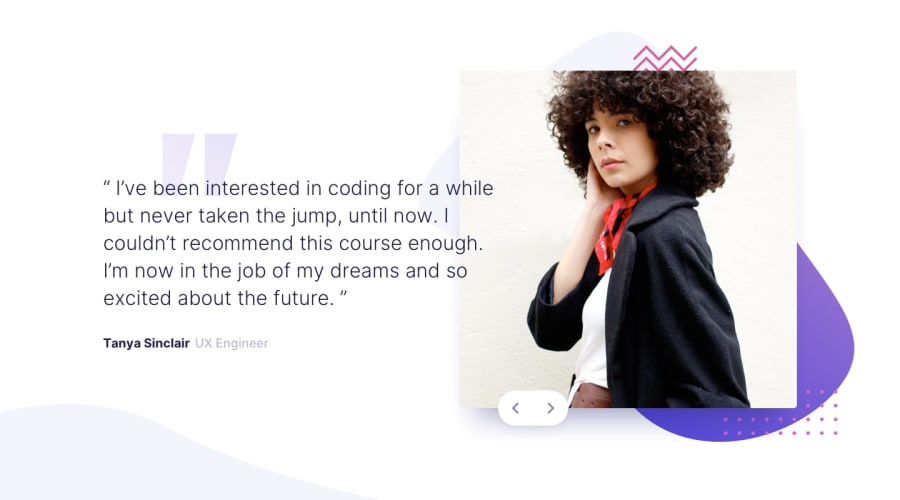
Design comparison
SolutionDesign
Solution retrospective
Feedback is greatly appreciated, thank you.
Community feedback
- @ApplePieGiraffePosted about 4 years ago
Hey, good job, Justin Voye! 👍
Your solution looks good and is responsive! 👏
I only suggest,
- Allowing the background images to take up the entire area of the viewport so that there isn't any empty white space when the screen is resized. You should be able to accomplish using the
background-sizeandbackground-positionproperties.
Keep coding (and happy coding, too)! 😄
1 - Allowing the background images to take up the entire area of the viewport so that there isn't any empty white space when the screen is resized. You should be able to accomplish using the
Please log in to post a comment
Log in with GitHubJoin our Discord community
Join thousands of Frontend Mentor community members taking the challenges, sharing resources, helping each other, and chatting about all things front-end!
Join our Discord
