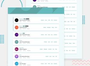
Design comparison
SolutionDesign
Solution retrospective
Feedbacks highly appreciated :)
Community feedback
- @AdrianoEscarabotePosted about 2 years ago
Hi Adeniyi Smart, how are you?
I really liked the result of your project, but I have some tips that I think you will enjoy:
- <html> element must have a lang attribute
-
- To improve the accessibility of the project you could have put an h1. Every page must contain a level 1 header, for people who use screen readers, identity what the main title is and follow the sequence h1-h5
The rest is great!
I hope it helps... 👍
Marked as helpful0@Iamweird2Posted about 2 years ago@AdrianoEscarabote thanks man, I'll make the corrections
1 - @avinashdvPosted about 2 years ago
Hi, The webpage looks really cool, nice work. A minor UI bug I came across: On selecting the tags, if there are only 1 or 2 jobs, the background color is covered for only the 2 jobs instead of entire body. Changing the h-auto to height:100vh on the div which is inside <div id="__next"> will solve this issue. I hope this helps, happy coding.
Marked as helpful0
Please log in to post a comment
Log in with GitHubJoin our Discord community
Join thousands of Frontend Mentor community members taking the challenges, sharing resources, helping each other, and chatting about all things front-end!
Join our Discord
