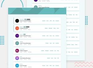
Design comparison
SolutionDesign
Solution retrospective
I realize my solution is a bit convoluted(js),but this is my first fetch api 'project',and any feedback would be helpful to me.
Community feedback
- @Yemisrach15Posted about 2 years ago
Hey Zijad,
- Take a look at the accessibility and html issues report on your solution.
- The clear button should be a button not a span as buttons are interactive and should be focusable for keyboard users.
- Same goes for the clickable
divs with classdisplay--tag. - It is responsive so good job!
Marked as helpful1@DelicZijadPosted about 2 years ago@Yemisrach15 thank you so much.What Type of project do you suggest i build next.That's my only issue,actually knowing what to attempt to do with my ,albeit Limited knowledge.Again,thank you.
0@Yemisrach15Posted about 2 years ago@DelicZijad Start with the newbie challenges. When you're comfortable with doing those, move on to the next level, junior challenges and so on.
It's my pleasure :)
0
Please log in to post a comment
Log in with GitHubJoin our Discord community
Join thousands of Frontend Mentor community members taking the challenges, sharing resources, helping each other, and chatting about all things front-end!
Join our Discord
