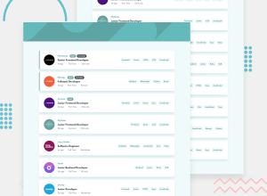
Design comparison
SolutionDesign
Solution retrospective
The filter functionality is not perfect yet. Getting the filter feature to work perfectly was a hassle
Community feedback
- @Yemisrach15Posted about 2 years ago
Hi Bakemonostan :) good job! Yeah, the filter has some bugs, work on it when you get the time. A few suggestion I believe will be helpful,
- Create an intermediate design/layout for tablet devices. You have a lot of space to the left and right but you're not using it.
- The div with class
header_imgis unnecessary. You could have the background image on the header element like this
header { background-image: url(/static/media/bg-header-mobile.b7750a0c3e0c016763b9.svg); background-position: 50%; background-repeat: no-repeat; background-size: cover; height: 150px; object-fit: cover; }- Don't use
outline: noneon elements as people using keyboard to tab through the page can't see which element is currently focused. - For heading elements, go in order of their level. Don't jump
h2&h3and useh4. - I would put the tags (
.roles) in a list within aul. - Also, try preferring
article,section, and other semantic HTML elements overdiv
1@bakemonostanPosted about 2 years ago@Yemisrach15 yeah. thanks, I learnt about the outline thing recently, worked on this project a while ago. I'll make time to go through the code again and do some refactoring.
I've learnt a lot since I worked on this. Thanks so much for the feedback
0
Please log in to post a comment
Log in with GitHubJoin our Discord community
Join thousands of Frontend Mentor community members taking the challenges, sharing resources, helping each other, and chatting about all things front-end!
Join our Discord
