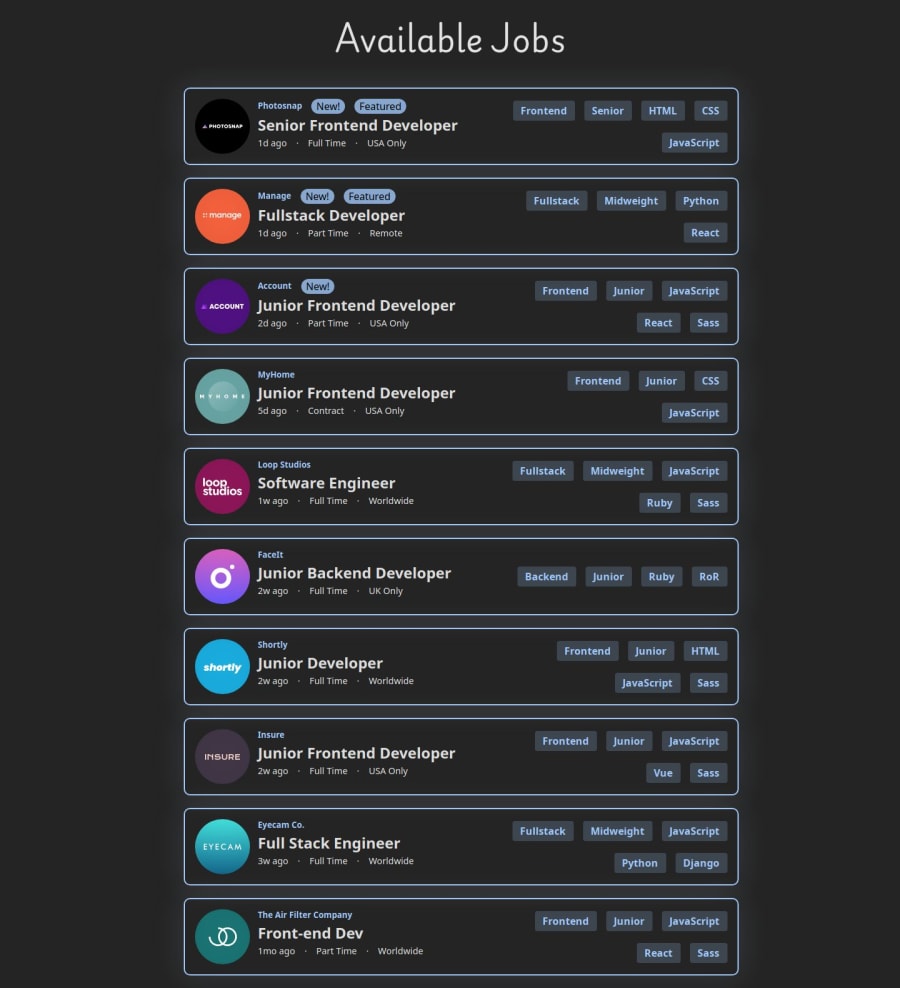
Job Listings with React, Framer Motion, and Material UI

Design comparison

Solution retrospective
I'm proud of the animations that I have for when you select a job to see more details. (See if you can guess what prompt I gave chatGPT to come up with those job details 👀). I'm also proud of the overall look on desktop because the CSS was very challenging. I tried many things but wasn't ultimately able to get the jobs centered on mobile :(.
What challenges did you encounter, and how did you overcome them?I'm still learning when it's appropriate or necessary to use an effect and state so that took some time to figure out. I think I may have used more effects than necessary but I'm not entirely sure. It was also a little confusing to figure out how to filter the jobs by traversing two different arrays and seeing if they have any matches to then display that job. I may have done that in a more expensive way than necessary but it works. The CSS was also very challenging with this one. One issue that I kept running into was when you filter for backend jobs, there's less stuff in that box than the rest so it would make my whole main div smaller. Almost like I had width: fit-content but I didn't. It was because I had some flexbox divs and I had to change them to display: inline so they wouldn't become smaller just because there was less space needed.
What specific areas of your project would you like help with?I would love feedback on my React architecture, like if I used effects and context only when needed and organized things well.
CSS feedback is also welcome!
Community feedback
Please log in to post a comment
Log in with GitHubJoin our Discord community
Join thousands of Frontend Mentor community members taking the challenges, sharing resources, helping each other, and chatting about all things front-end!
Join our Discord