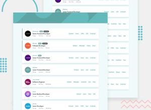
Design comparison
SolutionDesign
Community feedback
- @hossammoustafa404Posted almost 2 years ago
Good job man. You can wrap tags in the upper box so that they don't go over clear button in small screens.
Marked as helpful0@GauthamRVanjrePosted almost 2 years ago@hossammoustafa404 yeah good suggestion, Thank you 😃
1
Please log in to post a comment
Log in with GitHubJoin our Discord community
Join thousands of Frontend Mentor community members taking the challenges, sharing resources, helping each other, and chatting about all things front-end!
Join our Discord
