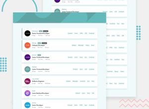
Design comparison
SolutionDesign
Solution retrospective
I tried my best. Any feedback will be thankful.
Community feedback
- @venky4cPosted over 4 years ago
The solution looks neat - The UI is very close to the original. I could not go through code, as I am just about to begin the project. I could see that you have not implemented the functionality of being able to filter/click on the LHS like 'Front End Developer'. It was shown as a requirement under the 'Active' tabs. Not sure if you missed it, or left it by choice.
1
Please log in to post a comment
Log in with GitHubJoin our Discord community
Join thousands of Frontend Mentor community members taking the challenges, sharing resources, helping each other, and chatting about all things front-end!
Join our Discord
