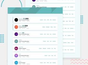
Design comparison
Solution retrospective
feedbacks are welcome :)
Community feedback
- @nelsonleonePosted almost 2 years ago
HELLO......congrats on completing this challenge🎉🎉well done.
But i noticed something with your solution , hope this comment was helpful and made meaning to you
Users can add tags which they have already chosen , you can correct this using
new SET()you can read more about it , in w3schools , or MDN DOCS.setTagsArray(prevTags => { return new Set([...prevTags,tag]) })To turn a SET back to an array so that you can use a map to render them You use a [...spread-operator]
[...setTagsArray].map()Have fun coding🎉
Marked as helpful0 - @Nnadivictory25Posted almost 2 years ago
Heyy man , just checked out your solution , here are things I think will be helpful
- Your nav is longer in height, reduce the height
- Your filter doesn't work also, it is not filtering the listings when I select a filter
- The cursor should not be pointed on everything on the page
Marked as helpful0@usmanahmedkhan09Posted almost 2 years ago@Nnadivictory25 thanks for your feedback can you explain a little bit more about filters in which cases these are not working so I can change my logic
0@Nnadivictory25Posted almost 2 years ago@usmanahmedkhan09 When a user click on the tabs , eg: frontend.
Only jobs with the frontend tag should be displayed And also even if the user adds more tags then listing(s) with exactly those tags added should be displayed
0
Please log in to post a comment
Log in with GitHubJoin our Discord community
Join thousands of Frontend Mentor community members taking the challenges, sharing resources, helping each other, and chatting about all things front-end!
Join our Discord
