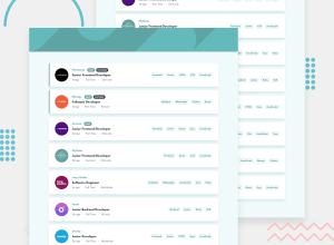
Job Listings with filtering (tweaked with some animation)
Design comparison
Solution retrospective
Any feedback is appreciated
Community feedback
- @BonreyPosted over 3 years ago
Hi, Jakub! Your site looks really awesome! 🙂 Especially with all these animations!
There's just one little problem that I see on my screen (which is 1280px wide): In the "Eyecam" section, filters stack on top of each other, since they don't have enough space. You'd probably want to fix that. Other than that, everything is responsive and fine!
And just one extra recomendation: add
transition: 0.3s(or any other number) to your filter buttons. This way, the background color will change more smoothly on hover.1@jakubzajacPosted over 3 years ago@Bonrey Hi, thanks a lot for your feedback! I've added the transition for the buttons, don't know how I could forget about it! As per the problem you've noticed, thanks for letting me know! I'll deffo investigate that
1
Please log in to post a comment
Log in with GitHubJoin our Discord community
Join thousands of Frontend Mentor community members taking the challenges, sharing resources, helping each other, and chatting about all things front-end!
Join our Discord
