Design comparison
Solution retrospective
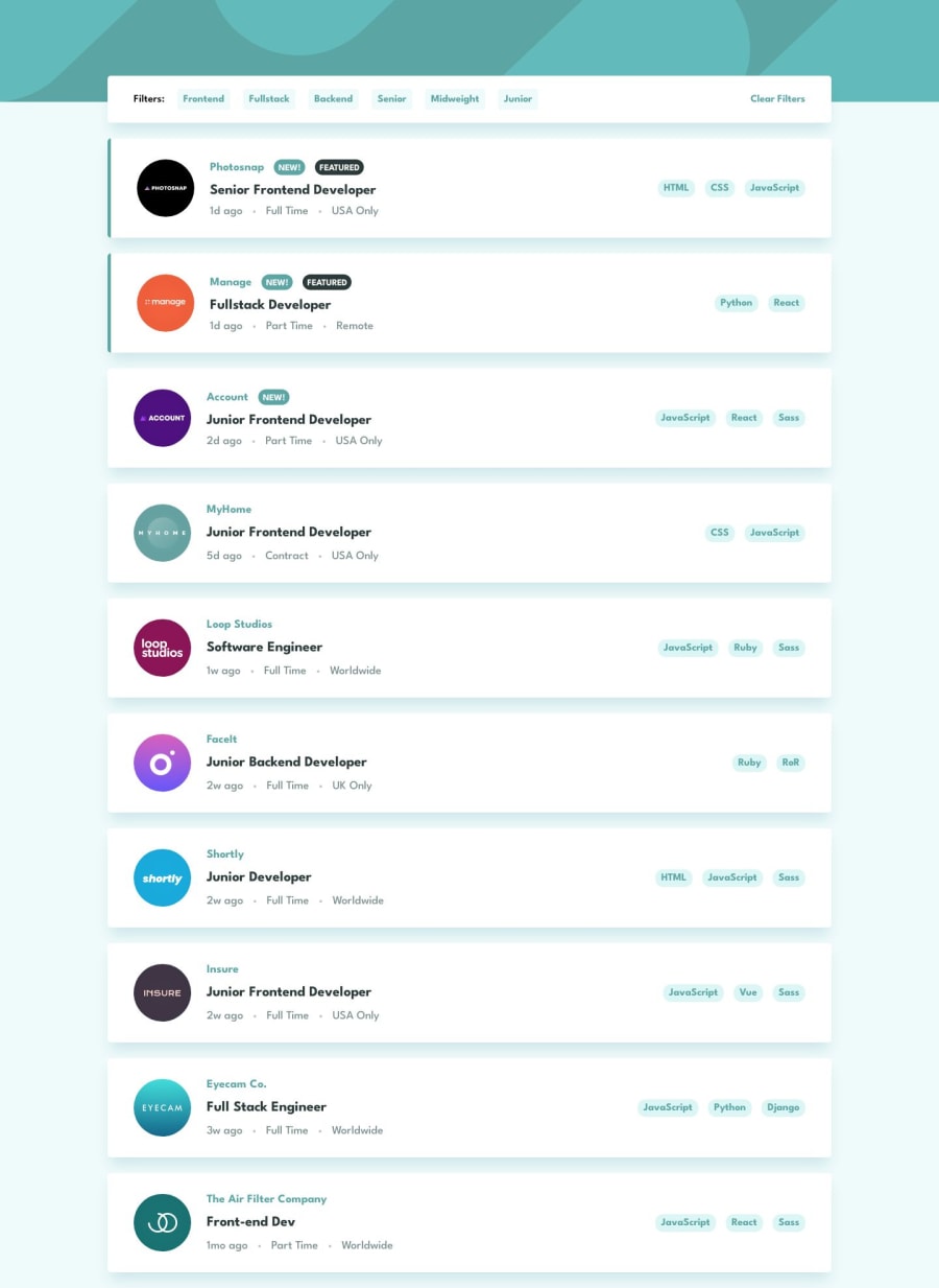
Hi all! Just getting some nice React practice in. Decided to take a different approach on the original design tho... from a UX standpoint it just didn't make sense if the filters are inside the actual job listing itself. This results in some filter options disappearing when active. So I opted to place filter buttons on the top of the page, as sort of a header component. Only the coding languages are now mapped inside the job listing component itself.
Let me know your idea's if you think this should be done better or different. :)
Community feedback
- @IheziePosted over 1 year ago
Hey! Great solution, it looks really cool. However, with your different approach, how would a user filter job listings by programming language?
0P@EdwinSchPosted over 1 year ago@Ihezie Hey Raymond, thanks! Yea, I guess I kinda sacrificed that particular option. ;) Although filtering by language is not the most common search anyway, the majority being job title or by company. But I think language buttons could also be part of the top bar. Maybe even combining as a multi-search... That would be an interesting idea for a second iteration of this project. :)
0@IheziePosted over 1 year ago@EdwinSch Yeah, I guess you're right about filtering by programming language not being the most common approach, but it is a nice feature to have😅. Regardless, I still think your style is good.
1
Please log in to post a comment
Log in with GitHubJoin our Discord community
Join thousands of Frontend Mentor community members taking the challenges, sharing resources, helping each other, and chatting about all things front-end!
Join our Discord
