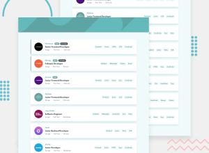
Submitted about 2 years ago
Job Listings with Filtering (React and a little SASS)
@davidbabatunde
Design comparison
SolutionDesign
Solution retrospective
An interesting build. Please drop a comment. Corrections are highly appreciated.
Community feedback
- @Yemisrach15Posted about 2 years ago
Hey David, solution looks pretty responsive :) A few suggestion I think would help you,
- For the images inside the header, you can use the
pictureelement to provide alternate images for difference device sizes. Here's a link for reference. Basically, what you have to do is as follow
<picture> <source srcset="<link to desktop image>" media="(min-width: 768px)" /> <img src="<link to mobile image>" /> </picture>- The remove (x) icon besides the tags should be a button since they're clickable. Buttons have the ability to be focused by keyboard users while the icon here is simply an image and there's no way of knowing whether it's interactive.
- Same goes for the clear element/button and the tags in the cards.
- For the
altattribute of images, you should provide a text that describes the image well for visually impaired users. So instead of a simple Company logo, you can be more specific and say, for instance, Photosnap's Logo.
Hope these are helpful to you :)
Marked as helpful1@davidbabatundePosted about 2 years ago@Yemisrach15 Thank you very much for your suggestions. I'll put them to use as soon as I can. I appreciate your help.
0 - For the images inside the header, you can use the
Please log in to post a comment
Log in with GitHubJoin our Discord community
Join thousands of Frontend Mentor community members taking the challenges, sharing resources, helping each other, and chatting about all things front-end!
Join our Discord
