Design comparison
Solution retrospective
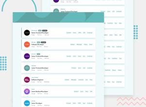
Really cool challenge, this time round including some cool animations that I added I also added a extra feature to the filtering, the user can choose whether the filtering should match every filter or just one of the filters is enough. So for example:
- Let's say we have a job with this filters: Frontend, HTML and the search filters: Frontend, HTML, CSS
- If Match All is active this job will not appear in the search because it lacks of the CSS filter but, if Match Some is active It will appear in the search cause it has the filters HTML & Frontend even thought it doesn't have CSS.
I hope my explanation is understandable😅
Any feedbacks are very wellcome!
Community feedback
- @ChamuMutezvaPosted about 3 years ago
You did a good job, but i prefer or maybe i am used used to the original version where , when something is filtered it has to be out of the screen. Scrolling a page in this current state is not good for my eyes when one block is one color then the next another color .
- click javascript 10 times then do the same with css (another 10 times) . You can continue as many times as you like with any of the filter selections
0@B1N4R1Posted about 3 years ago@ChamuMutezva Yeah you are right I should change that. The 10 times thing is already fixed
Thanks for the feedback!
0
Please log in to post a comment
Log in with GitHubJoin our Discord community
Join thousands of Frontend Mentor community members taking the challenges, sharing resources, helping each other, and chatting about all things front-end!
Join our Discord
