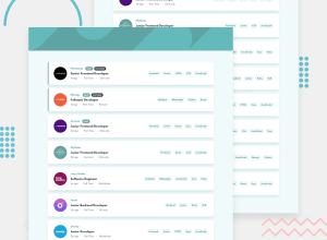
Responsive Job Listing - React Typescript
Design comparison
Solution retrospective
I will be glad if you write a review about the code structure.
Community feedback
- @PeshwariNaanPosted about 2 years ago
Hello Giorgo and nice work completing the challenge.
Here are a couple tips that might help.
-
There is an issue on the mobile view if you select more than two skills. After that, everything gets pushed off the page. The container div in your filters component needs to have a media query to change the size of the container.
-
Also if you want to get rid of the landmark warnings just wrap a <main> tag around your root div in the index.html file like this:
<main>
   <div id="root"></div>
</main>
I hope this helps - Happy coding
Marked as helpful0@GioBitsaPosted about 2 years ago@PeshwariNaan Thank you very much for reviewing my solution. I will fix all issues listed here. 👍
0 -
Please log in to post a comment
Log in with GitHubJoin our Discord community
Join thousands of Frontend Mentor community members taking the challenges, sharing resources, helping each other, and chatting about all things front-end!
Join our Discord
