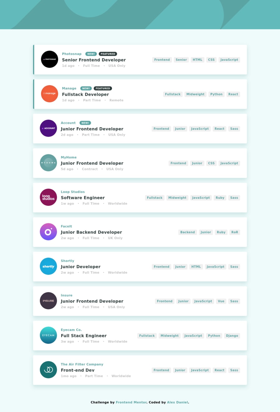
Job listings with filtering created using React, Redux and Sass
Design comparison
Solution retrospective
I would love to hear some feedback from you!
Community feedback
- @hardy333Posted over 3 years ago
Everything works great, nice solution. I am going to take this challenge as well but, with only vanilla js. and maybe another time I also will try with React stack like you :D. It is interesting what was a size of your distribution project since you also use redux and some libraries as well? :D I will check it later.
4@p-alexPosted over 3 years agoHey @hardy333! You should definitely take on this challenge. It was a lot of fun to build and I actually learned how to filter data with multiple match criteria.
About the distribution project size ... I'm not quite sure where to look at it :)). But I think you are talking about the folder that I pushed to netlify and the folder's size is only 1.26MB.
Thank you so much for the comment and good luck with the challenge!!
2 - @pikapikamartPosted over 3 years ago
Hey, your solution looks good and it functions very well.
Resizes well when going in mobile state which is good, one thing to suggest is that. Maybe change the background-color of the filter items, because right now, it is the same with the overall background-color and that box-shadow is the only thing that is separating it.
Changing that to white like the original will be awesome, so that it will be contrasted well and pop out a bit more.
But still, your work is really awesome^^
0@p-alexPosted over 3 years agoHey @pikamart! You are absolutely right about the background color. I don't know why I left it like this because a white background looks a lot better. I'll change it now.
Thank you so much for the comment!
1
Please log in to post a comment
Log in with GitHubJoin our Discord community
Join thousands of Frontend Mentor community members taking the challenges, sharing resources, helping each other, and chatting about all things front-end!
Join our Discord
