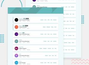
Design comparison
Solution retrospective
Hi everyone, this is one of my first projects using React.js (still learning this). How does it look to you?
Also, does anyone have any idea how to remove the extra space above and below the text? (e.g. see the buttons, the text inside seems off-center due to these spaces) Is it possible to do this in Sass or do I need to apply changes directly to the font before importing it into the stylesheets? I mean, maybe I could implement a mixin that automatically sets the line-height based on the font-size. Or is this problem solved in another way? This is a issue that I often encounter and I still don't understand how to solve it. In any case, thanks for your attention!
Community feedback
- @DrKlonkPosted over 3 years ago
Looks good to me!
What do you mean with the extra space below the text? Which text(s) do you mean?
I think the buttons look a bit off centre because of 1) the font-family and 2) the fact that these words have little letters going down of the baseline (like g, p, or y for instance), making it a bit more obvious. It's a bit harder to get annoyed with the pixels in "Python" than it is in "Frontend", in my opinion.
Here's my font-family proof: If you change the font to monospace, the clickable labels look fine.
Fix for the smaller labels: On the labels like "NEW!" you could just add some more padding to the top in the job__feat class. I don't see much problem with that, except when you decide to change the complete font family, in which case you'd need to adapt at most 2 lines of CSS. No biggy.
Minor improvement: I'd also add a good old
cursor: pointer;to thejob__positionclass.Cheers, Joran
2@DrKlonkPosted over 3 years agoThis image shows how this font has a higher number of pixels above the top of a small "o" than below it. That will differ per font.
(Should've put the above measurement next to the "h")
1@MarcoCarpoPosted over 3 years agoI understand, now it's clearer to me, it depends on the font itself then. Indeed the figure explains well. Thanks for the advice, I'll apply them to the project!
0 - @mbart13Posted over 3 years ago
hey, I just completed this challenge, so I thought I would share my thoughts. This is really good and functionality is actually working, which is not always the case with some other challenges I saw :) I like that you also used reducer.
One thing that maybe I would do differently is, you are keeping in your state both jobs and filteredJobs. I think you should keep only jobs, and filter them in the component Imagine you have 100K jobs, not 10. You would initially had twice as many data0
Please log in to post a comment
Log in with GitHubJoin our Discord community
Join thousands of Frontend Mentor community members taking the challenges, sharing resources, helping each other, and chatting about all things front-end!
Join our Discord
