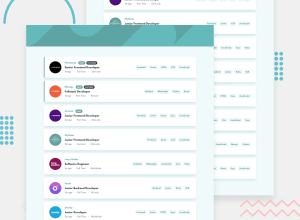
Design comparison
SolutionDesign
Solution retrospective
Please give me any feedback , I hope me can improve skill and better every day , thank you so much <3
Community feedback
- @ChamuMutezvaPosted almost 4 years ago
Hi .
- The best place to start is with the feedback from the report above, where some issues are to do with duplicate id's - you can opt to use a class instead. You can only use an id name once .
- The idea of the project is to be able to filter cards when you click on the referred items in the designs - at present this is not happening.
- Notably , the background image is missing on your mobile presentation
- The search is not displayed well on mobile as the important text is cut off, I don't know what to search and probably it would be helpful to give a hint to users on what needs to be done
- An li tag is used to represent an item in a list, i see yours has a couple of other elements notable an img , div and a nested ul. You need to relook on this as i believe it is not it's proper use.
- The buttons in the ul tag as well cannot be standalone without the li tag. The above issues will have an impact to screenreaders as information will be confusing. Generally the display is good. Hope you will find this useful
2@lythanhhaiPosted almost 4 years ago@ChamuMutezva Thank you very much , the judge and feedback of your really so useful to me , about problem with duplicate id's , i will improve it . filter cards when you click on i am making it more perfect . I really thank you about this comment . hope get more feedback of your
0 - @docuong0912Posted almost 4 years ago
đẹp quá, keep it up, good work!!
0@lythanhhaiPosted almost 4 years ago@docuong0912 em cảm ơn anh nhiều , mong anh feedback em những lần sau ạ
0
Please log in to post a comment
Log in with GitHubJoin our Discord community
Join thousands of Frontend Mentor community members taking the challenges, sharing resources, helping each other, and chatting about all things front-end!
Join our Discord
