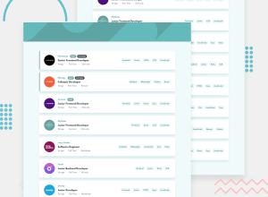
Design comparison
SolutionDesign
Community feedback
- @festsnusaPosted almost 2 years ago
Hi there! Congratulations for completing this challenge.
Here are some bugs I've noticed:
- when I resized my screen for mobile devices, your background image in header didn't change;
- your filter works incorrectly. for example, i picked "Frontend" and only 6 cards left (as planned). But when I add "CSS", 6 cards remain. in my opinion, in this case, only 2 cards should remain visible;
- not quite sure if implementing React for this challenge was necessary. but when I refresh the page, the filter is lost. Perhaps, you should save user's picks to localeStorage.
Hope you find my feedback useful. Happy coding!
Marked as helpful1@latif-essamPosted almost 2 years ago@festsnusa Thanks for these notes, I will work on the design and improve it.
- you are right about the header, I will fix it.
- The bug you have mentioned is not quite true, the way my filter works is by displaying all the jobs that have any of these tags, not the opposite, and this can be converted by changing the conditional statement.
- I choose React because I'm using all the designs in much bigger projects, and the state of the filter will be saved in Redux or local storage but not here.
0
Please log in to post a comment
Log in with GitHubJoin our Discord community
Join thousands of Frontend Mentor community members taking the challenges, sharing resources, helping each other, and chatting about all things front-end!
Join our Discord
