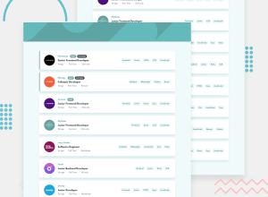
Design comparison
SolutionDesign
Solution retrospective
What challenges did you encounter, and how did you overcome them?
Could they have chosen a worse font? Probably not. The baseline alignment was so off that I had to manually adjust the text’s position with translateY to get it properly aligned with the surrounding elements.
How do you handle issues like this? Are you like me, aiming for pixel-perfect alignment, or do you take a more relaxed approach?
Community feedback
Please log in to post a comment
Log in with GitHubJoin our Discord community
Join thousands of Frontend Mentor community members taking the challenges, sharing resources, helping each other, and chatting about all things front-end!
Join our Discord
