Design comparison
SolutionDesign
Community feedback
- @venky4cPosted over 4 years ago
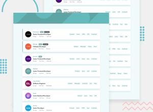
The desktop version is good. In mobile version the header image is missing. Also when we try to filter, the input filter gets cut off. I have tested it in Firefox, I am not sure if it is a browser issue. Functionality works fine. Great job!
0@chelsi-001011Posted over 4 years agoThank you so much! In mobile version i went solely according to the guide provided. It is according to 375px size.
0
Please log in to post a comment
Log in with GitHubJoin our Discord community
Join thousands of Frontend Mentor community members taking the challenges, sharing resources, helping each other, and chatting about all things front-end!
Join our Discord
