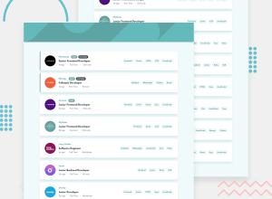
Job Listings - ReactJS Tailwindcss JS Array Methods
Design comparison
Solution retrospective
I have no questions, but this is my third ReactJS application, so there's plenty to learn, and I'll take any advice.
Really enjoying React so far as often the complicated code gets sandboxed into a component. Modern JS if fun when you use the Array methods.
Community feedback
- @AlexKMarshallPosted about 3 years ago
This looks very good, it's nice and responsive, and the logic in App.js is clean.
On very wide monitors the jobs get quite wide. I would maybe put it all in a max width container so that things don't stretch too wide.
The conditional logic in the job for showing the badges works, but to my tastes it's a bit far from where it's used. You can actually inline that kind of simple conditional logic into your jsx directly.
So you could have something like
<div className="mt-3 flex items-center">
          <h3 className="text-sm font-bold text-primary-200 items-center">
            {company}
          </h3>
          {isNew ? <NewBadge/> : null}
          {isFeatured ? <FeaturedBadge/> : null}
</div>
It's a matter of taste, but that's a pretty common pattern.
Also, make sure to take care of the html structure. Your headings jump straight to h3's with no h1 on the page, or any h2s. Tailwind can tend to encourage a div-soup style of markup, but it doesn't have to be used that way. Try to use semantic elements where possible. For instance, this is a list. It should be a
<ul>with<li>elements inside.And make sure clickable things are actually buttons, not just divs faked to half-behave like buttons. The filters should all be real buttons. Super important for keyboard accessibility.
Marked as helpful1 - @notapatchPosted about 3 years ago
Well that's brilliant @AlexKMarshall
I've fixed with max-width - I was missing a wrapper around the job list.
Conditional logic - It's much nicer to have the logic spread over fewer lines - think that's called more cohesion?? Anyway, improvement.
Div soup. I made a change for the list. Hopefully that's better? If that's right I'll look through the rest of the app.
  <div className="lg:flex-1 lg:justify-end bg-white flex items-center rounded">
        <ul className="mt-5 flex flex-wrap content-start gap-4">
          {jobFilterList.map(filter =>
            <li key={filter} >
              <button
                className="p-2 self-center text-sm font-bold text-primary-200 hover:text-white bg-neutral-400 hover:bg-primary-200 rounded"
                onClick={() => handleAddFilter(filter)}
              >
                {filter}
              </button>
            </li>
          )}
        </ul>
      </div>
The H3, I mistakenly thought you should only have 1 H1. That isn't the case. I've updated the H3 to H1.
Anyway, I've put acknowledgement for your code review in my README.me. Thanks, again!
0@AlexKMarshallPosted about 3 years ago@notapatch Ah sorry, yeah I perhaps wasn't clear on the h1. There should only be one of them on the page. The design doesn't really have a title on the page. I think it really should, but I guess this is really a component that would take up part of a bigger page in a real app. In that case your h1 would be somewhere else.
In the absence of a visible title, then it's worth putting a visually hidden h1 with something like "Job Listing Board" as the page heading. And then the next level down will be h2s.
Your ul/li for the filter list looks good there.
I'd also make the jobs themselves li's inside an outer ul
Marked as helpful1
Please log in to post a comment
Log in with GitHubJoin our Discord community
Join thousands of Frontend Mentor community members taking the challenges, sharing resources, helping each other, and chatting about all things front-end!
Join our Discord
